Align
Define outcome and constraints
The group agreed a 12-month goal, target user and business metrics, scope and constraints before discussing solutions.
Why it mattered: every later prioritisation could be evaluated against the same outcome.
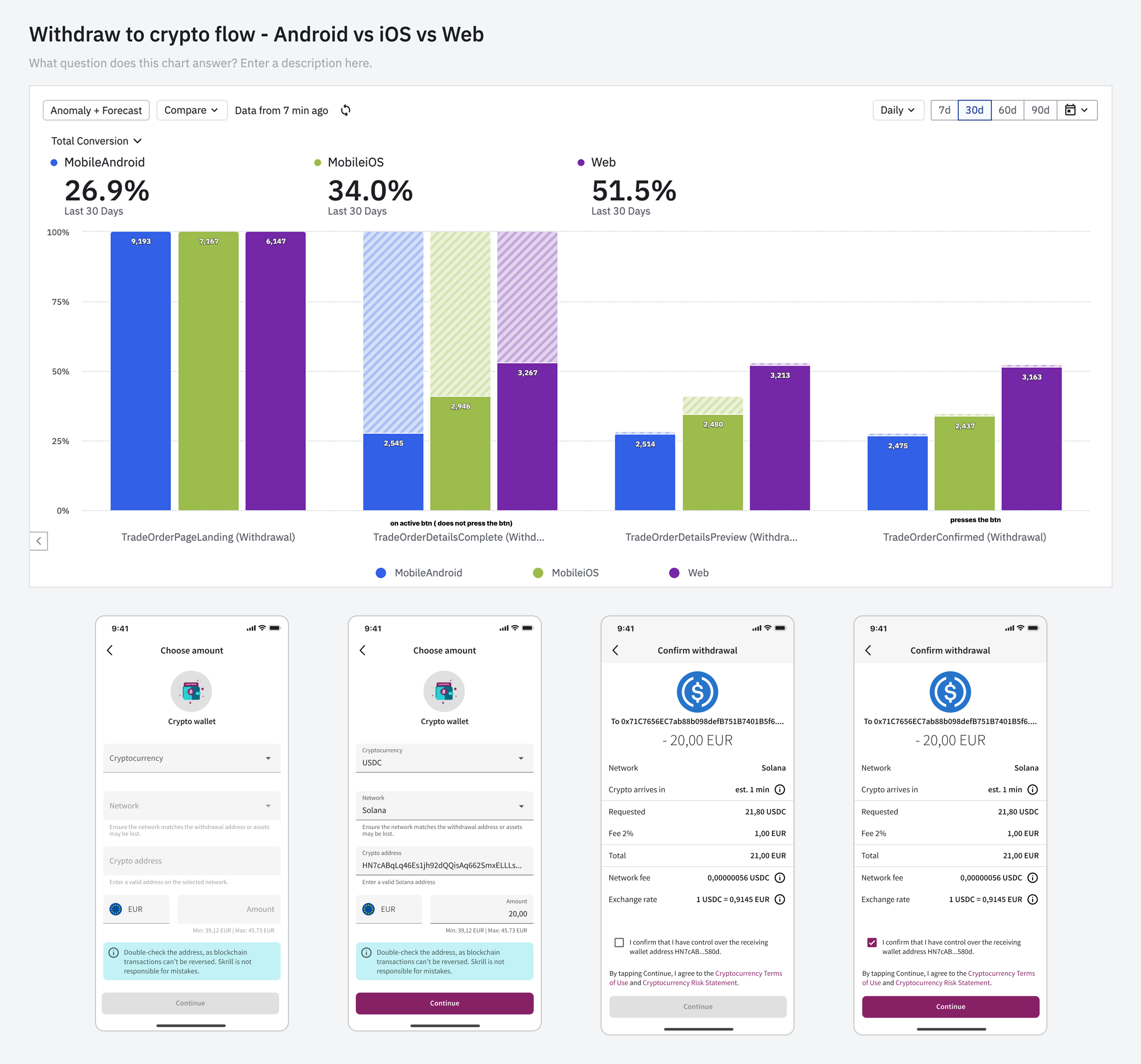
Finding the real problem behind a 50% funnel drop-off on a single step. The data showed where users abandoned a fast-growing money-out journey, but not why. I led discovery, alignment, ideation, product design and testing. I exposed a discoverability problem before the step with the 50% drop-off and redesigned the journey within legal and technical constraints.
Withdraw to crypto wallet lets a user spend fiat in Skrill to buy crypto and send it directly to an external wallet in one transaction. It was one of the fastest-growing money-out features, yet more than half of users left at one step and support contacts persisted.
The immediate temptation was to redesign the step highlighted in Amplitude. That would have treated the visible symptom as the cause.
I proposed a structured discovery and alignment cycle before interface work to test whether the primary barrier sat inside the measured funnel - or before users entered it.
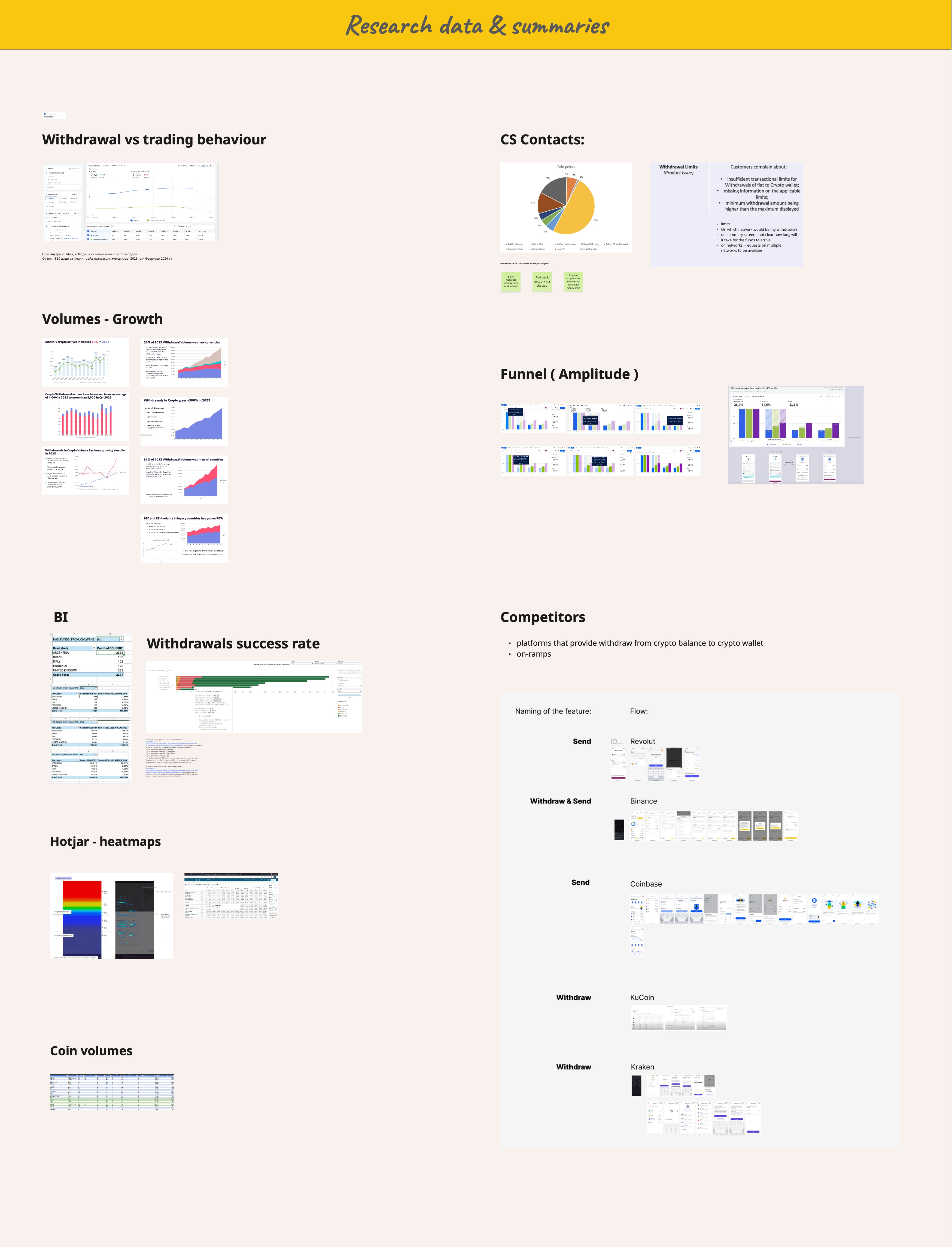
I worked with Product, Analytics and Support to collect the evidence in one shared space, write hypotheses for the drop-off and name how each could be checked.
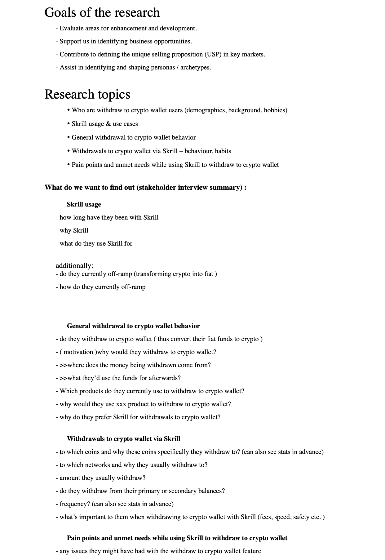
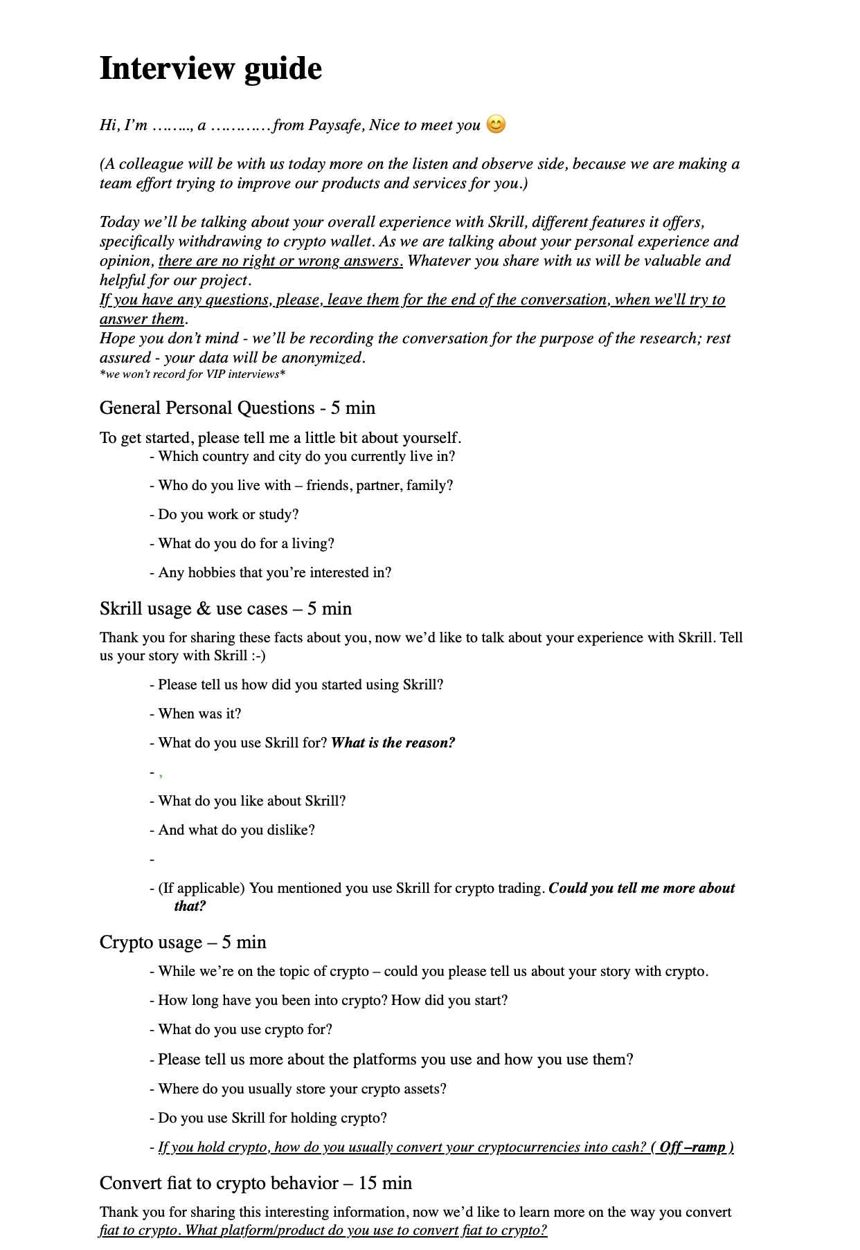
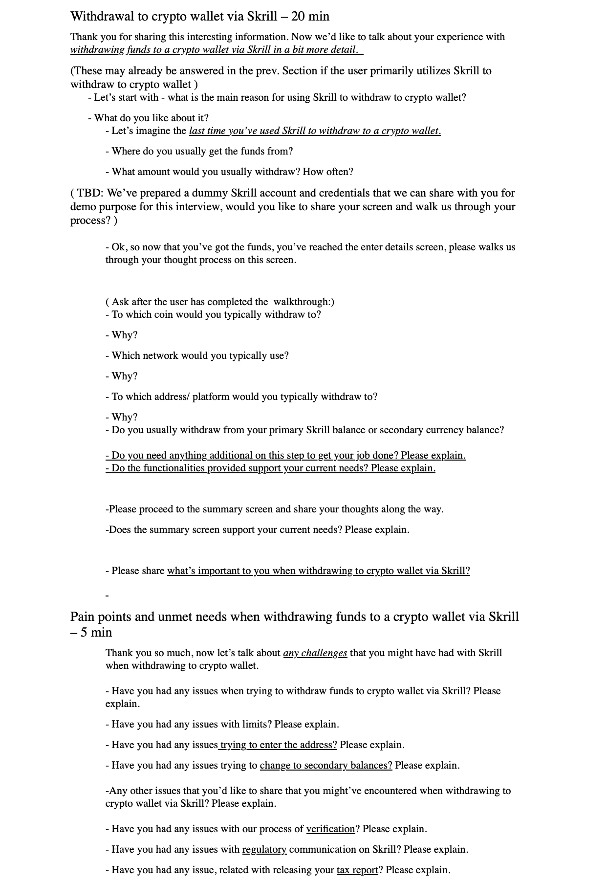
I ran ten moderated sessions on mobile and ten on web. The mobile group included five Skrill users and five non-users across the UK, Brazil, Italy, Portugal and Argentina.
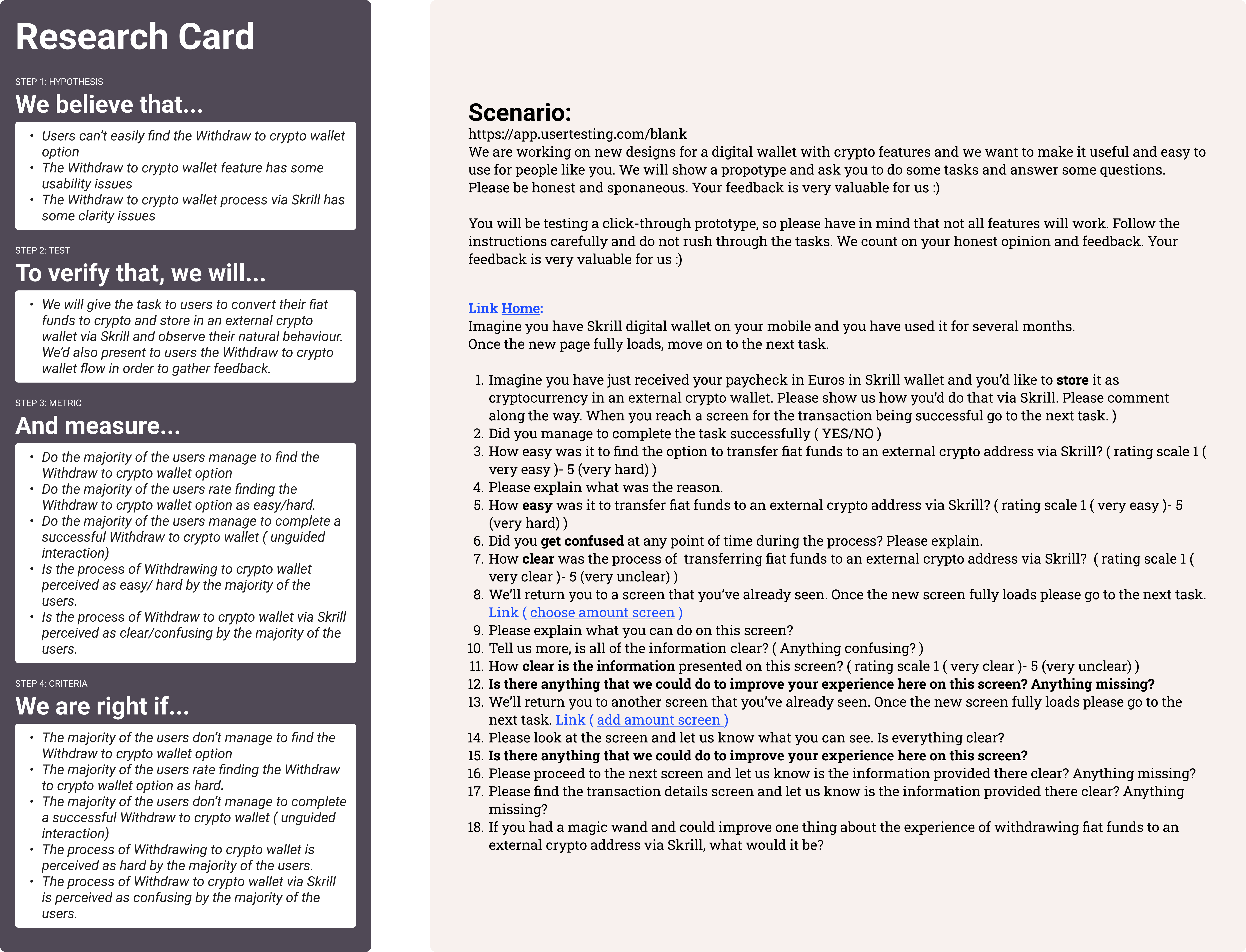
Users abandoned the journey partly because they could not find or predict it - not only because the amount step was difficult.
That evidence expanded the scope from optimising one screen to improving entry, comprehension and the critical information shown before commitment.

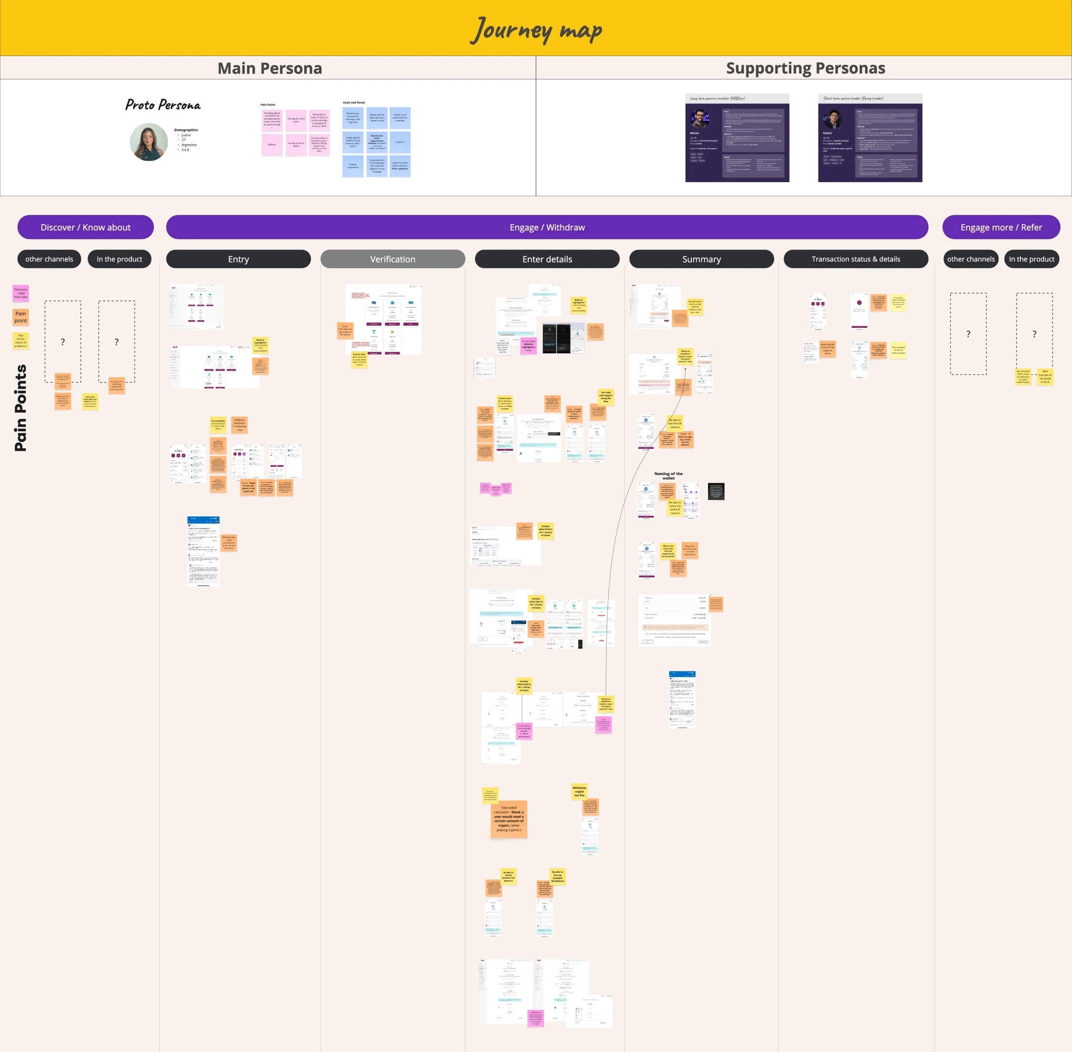
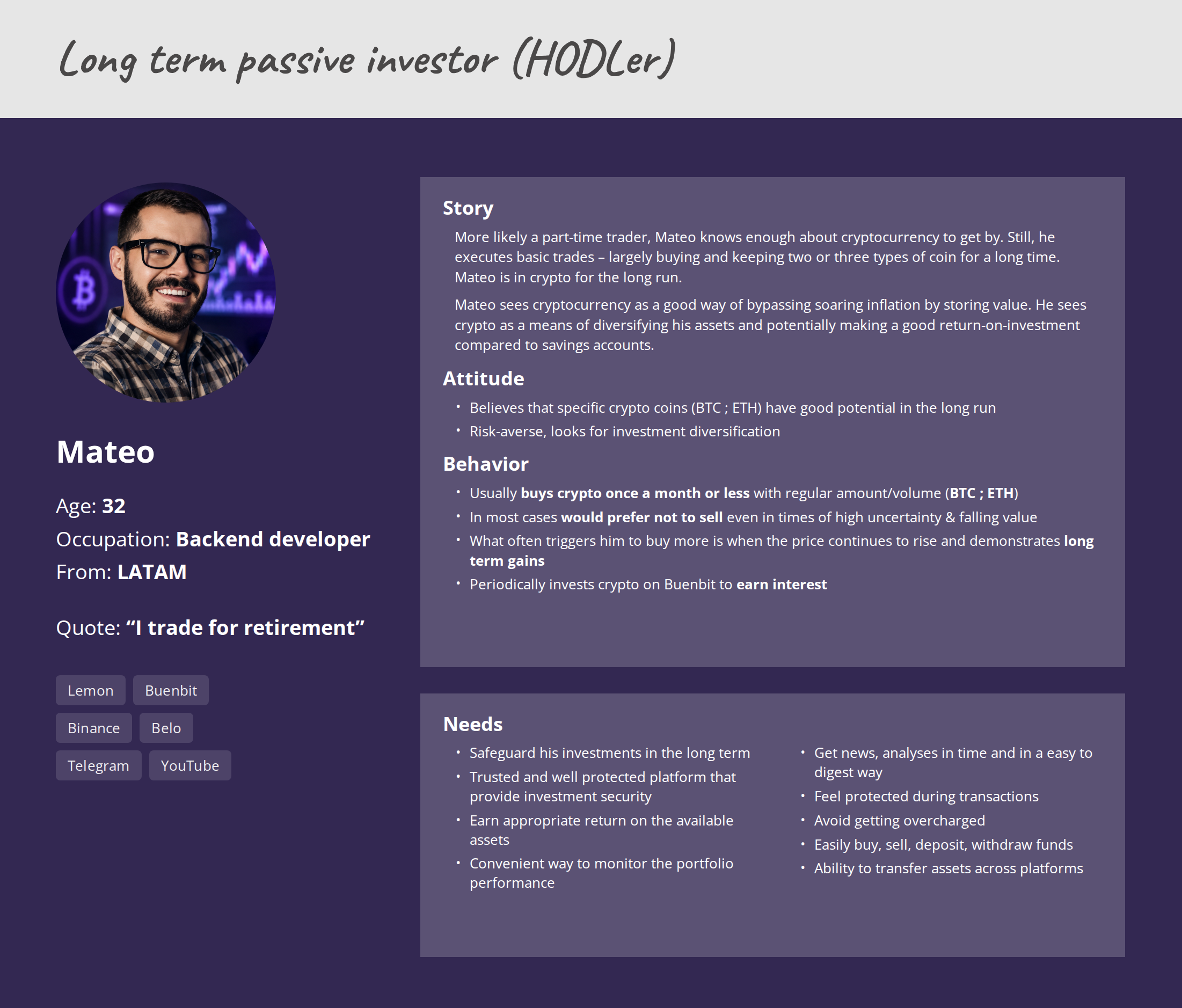
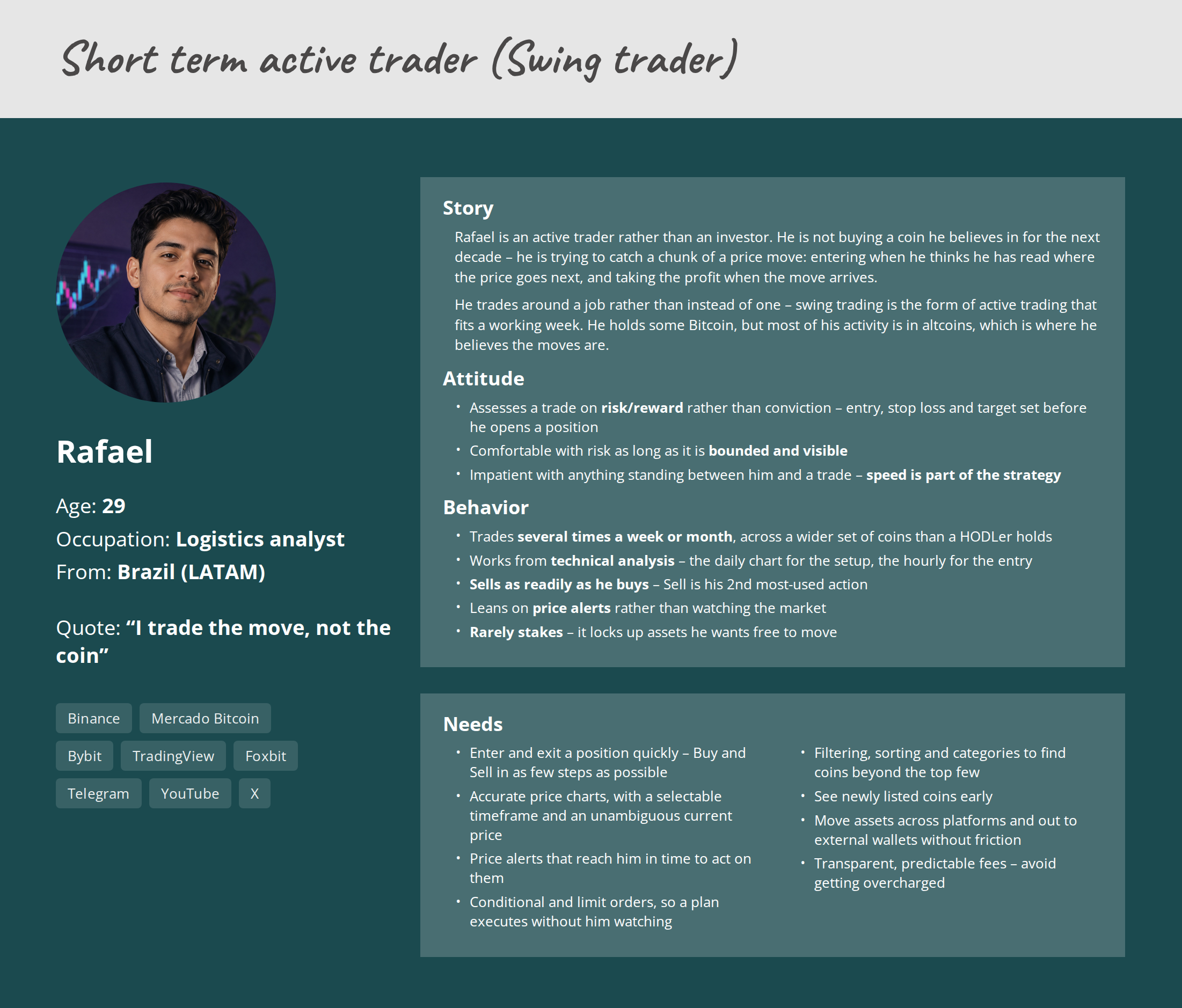
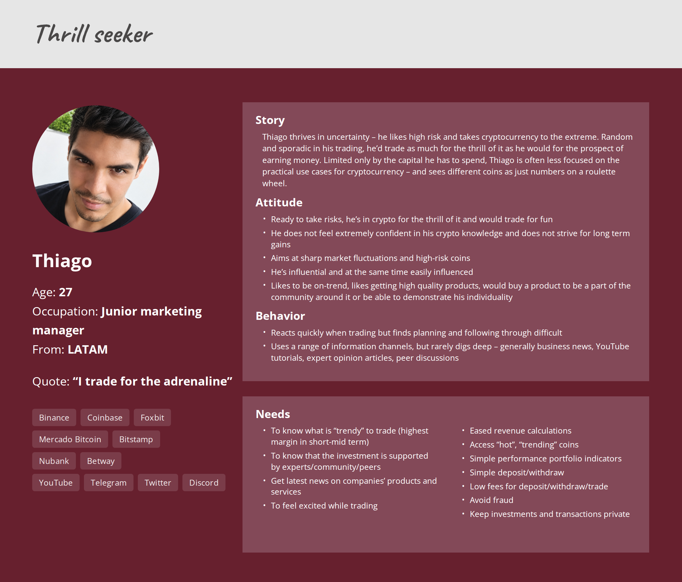
I facilitated time-boxed workshop sessions following the design thinking methodology with Product, stakeholders and Engineering. Silent individual writing reduced anchoring; voting helped the group converge on the problems with the strongest user and business value.
The group agreed a 12-month goal, target user and business metrics, scope and constraints before discussing solutions.
Why it mattered: every later prioritisation could be evaluated against the same outcome.
Journey mapping produced 16 distinct problems. We ranked them by user and business value, then by impact and implementation effort.
Trade-off: lower-value friction remained visible, but did not consume the release.
Six selected problems became How Might We prompts, followed by timeboxed ideation, voting and competitor lightning demos.
Result: solution work stayed traceable to the evidence rather than becoming an open-ended redesign.
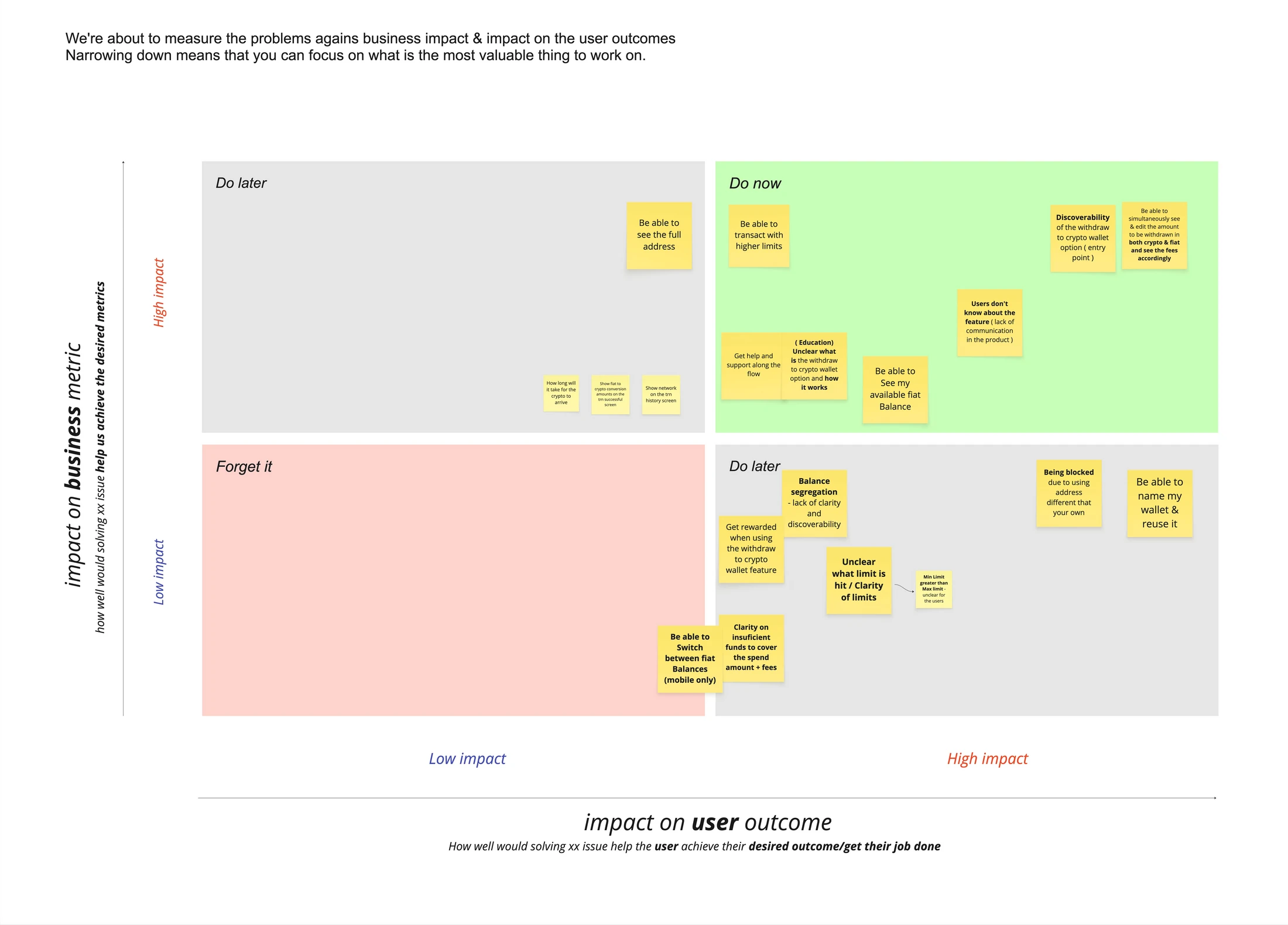
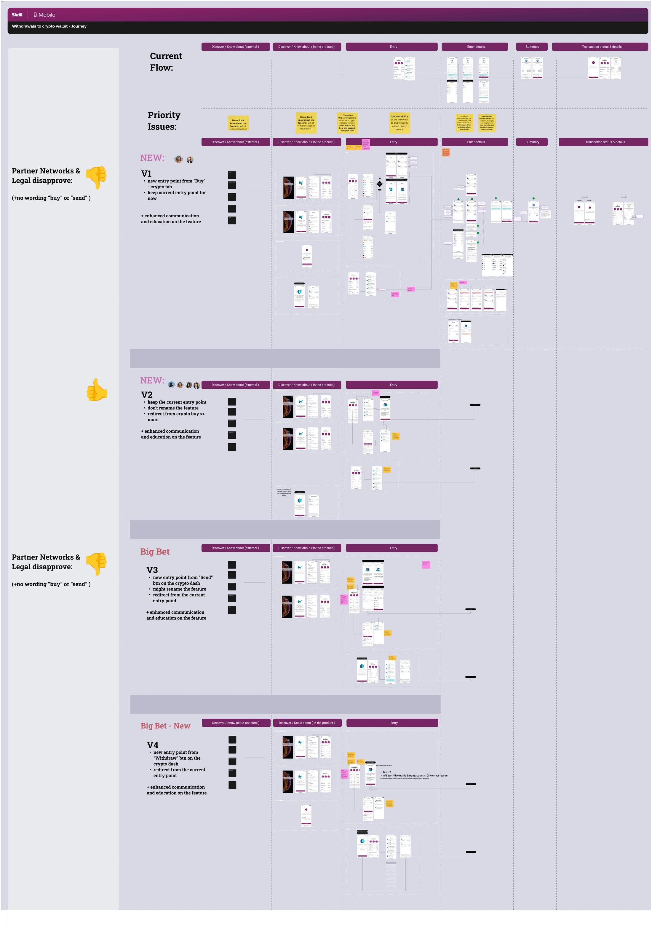
I designed four journey variants for app and web and reviewed them with Design, Product, Engineering, Legal and partner networks.
Two variants relied on clearer for the users naming for the new entry point, but constraints ruled out “Buy” and “Send” labels. The feature had to retain its “Withdraw to crypto wallet” naming.
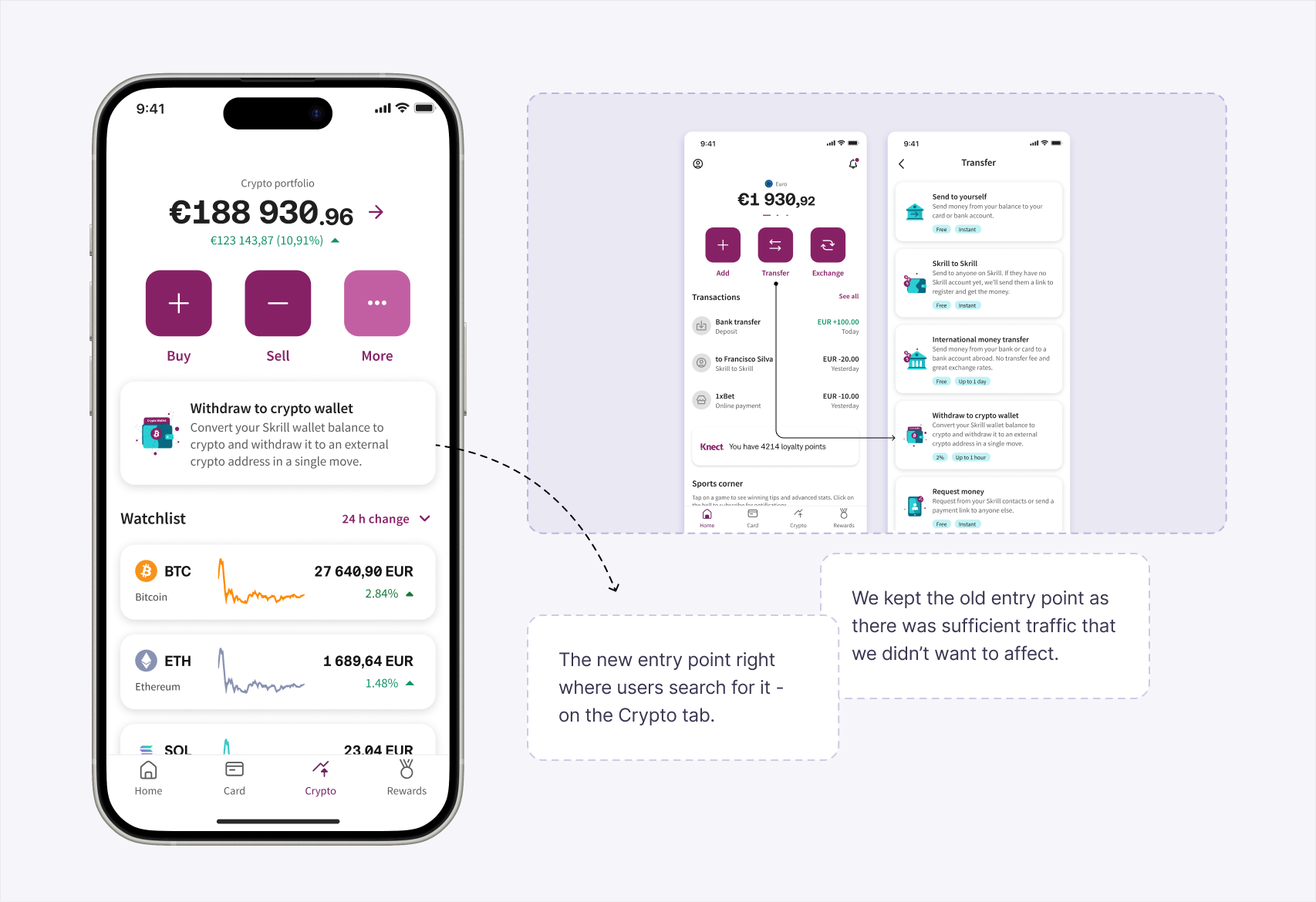
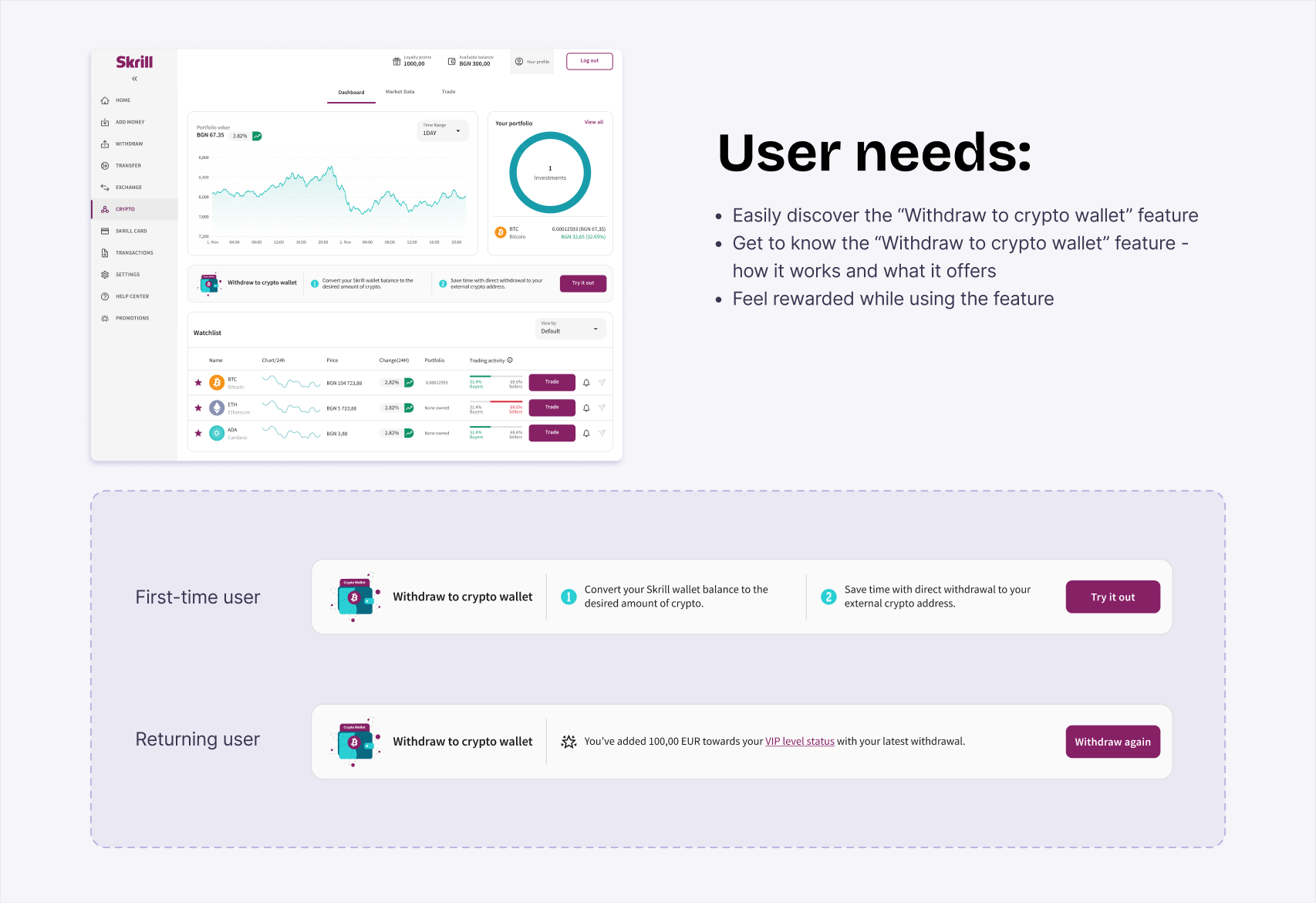
I stopped relying on the label alone. A descriptive card at the top of the crypto dashboard explained the feature where crypto-oriented users already looked. The route under Transfer remained for established behaviour.
The “Buy” button leads the user to either buy crypto and store it on Skrill or send it to an external crypto address.
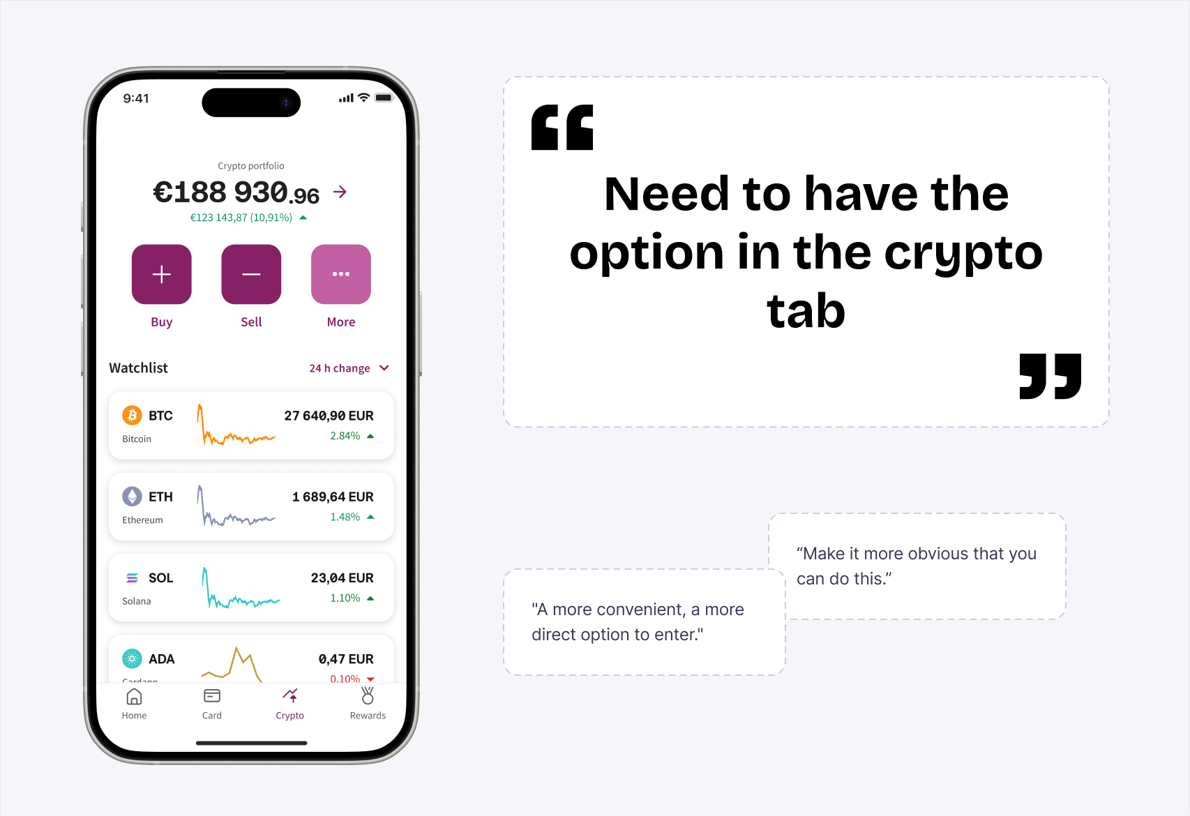
In the usability test of the initial flow, the majority of users searched for an option under “Buy” on the Crypto tab.
Product: 4 votes · Design: 2 votes
Partner Networks and Legal disapproved the use of “Buy” or “Send.”
Testing was paused to save effort after the feature failed partner-network and legal approval.
The “More” button opens a list of secondary actions, with withdrawal as one of them.
In the usability test of the initial flow, the majority of users searched for the option under “Buy” or “More” on the Crypto tab.
Product: 1 regular vote and 1 decider vote · Design: 4 votes
No constraints from Partner Networks or Legal.
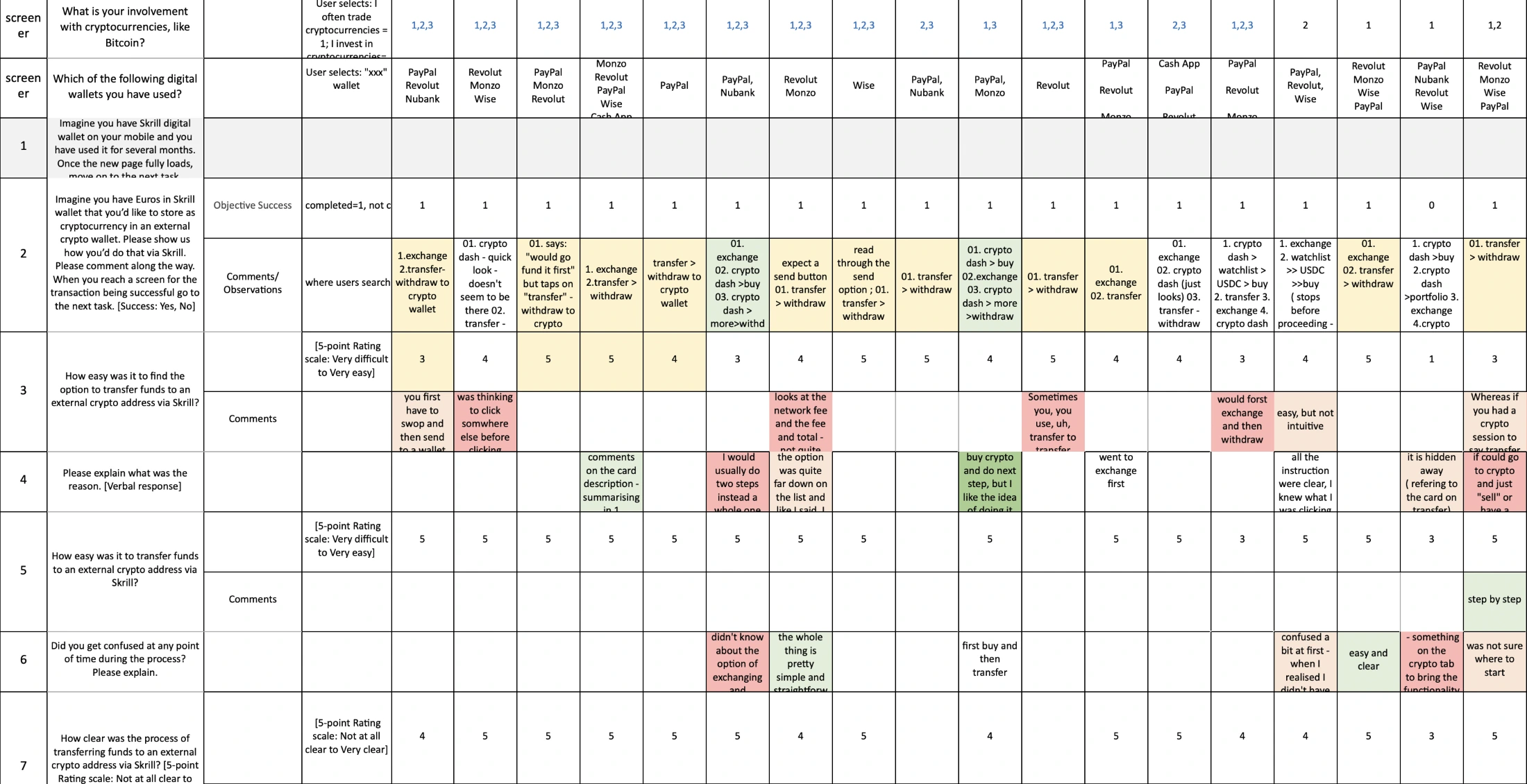
Ease of finding the entry point: 3.5/5. One out of five users who searched on the Crypto tab completed the withdrawal through “More.”
The “Send” button leads the user to either send crypto to an external crypto address or send crypto to another Skrill user.
Research across exchanges, digital wallets and on-ramps revealed that “Send” and “Withdraw” are the most common labels for similar functionality.
Product: 3 votes · Design: 0 votes
Partner Networks and Legal disapproved the use of “Buy” or “Send.”
Testing was paused to save effort after the feature failed partner-network and legal approval.
A dedicated “Withdraw” button on the Crypto tab leads the user to the functionality.
Research across exchanges, digital wallets and on-ramps revealed that “Send” and “Withdraw” are the most common labels for similar functionality.
Product: 1 decider vote · Design: 0 votes
No constraints from Partner Networks or Legal.
Ease of finding the entry point: 4/5. Two out of five users who searched on the Crypto tab completed the withdrawal through the “Withdraw” button.
A dedicated “Withdraw to crypto wallet” card on the Crypto tab leads the user to the functionality, supporting discoverability and understandability.
Research showed that “Send” and “Withdraw” are common labels for similar functionality. User testing showed that users understood the feature’s purpose much better when the entry point included an additional descriptive label.
Product: 4 votes · Design: 6 votes
No constraints from Partner Networks or Legal.
Ease of finding the entry point: 4.7/5. Two out of five users who searched on the Crypto tab completed the withdrawal through the new entry point.
After the legal review, I revisited the approved flows because they would have missed the user and business goals. I designed a new entry point that makes the feature visible exactly where users searched for it - on the crypto dashboard and explains its mechanics - supporting the user need for clarity on what is the functionality and how it works.
Ten participants evaluated each proposed journey across app and web. Testing measured entry-point discoverability, overall ease and end-to-end clarity.
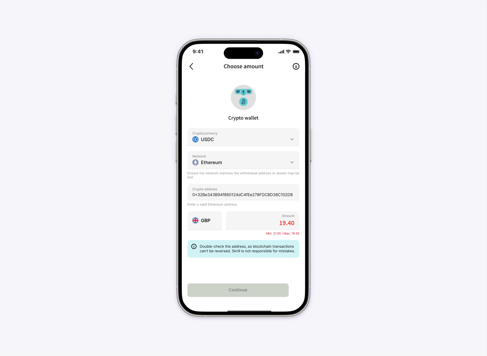
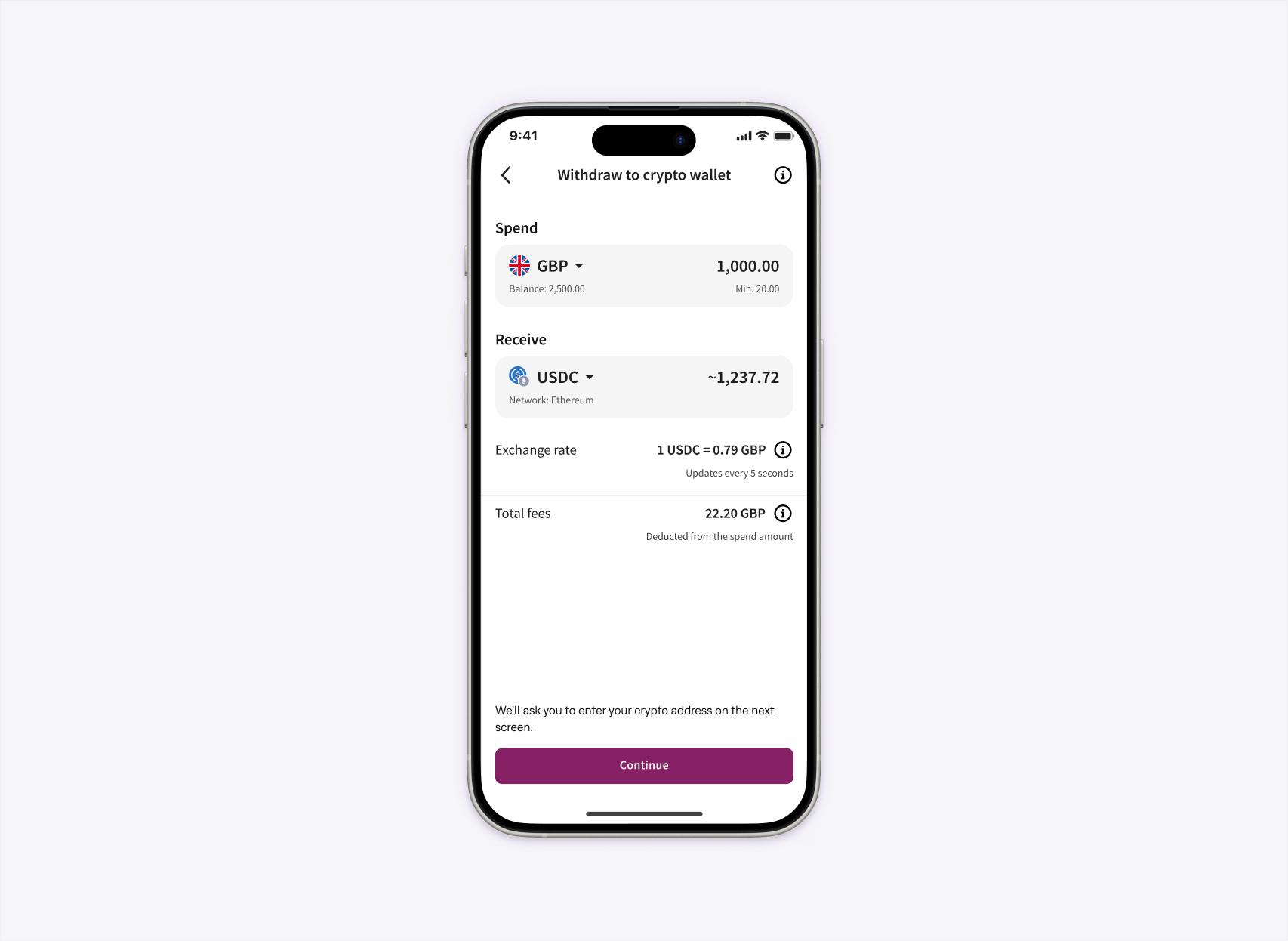
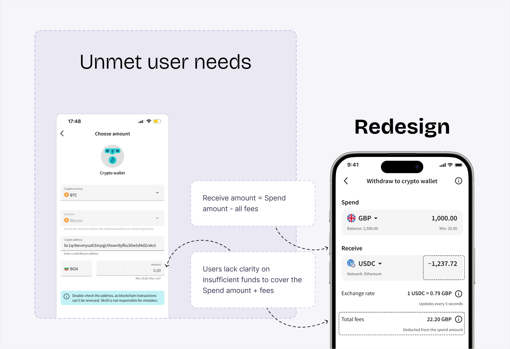
This details step triggered the initiative. The old screen asked for the cryptocurrency, network, wallet address and amount at once, then showed contradictory limits beside a disabled Continue button. The redesign separates Spend and Receive, shows the balance, balance segregation, accurate limits, live exchange rate and total fees upfront, and moves the wallet address to its own step.
Drag the handle or use the arrow keys to compare
Fees were absent from the Enter amount screen and added on top of the spend amount. Because the displayed limits ignored them, users could not tell whether their balance covered the amount plus fees. They also could not see the exchange rate or how much crypto would reach their wallet. The redesign brought those details forward and kept a full fee breakdown available on demand.

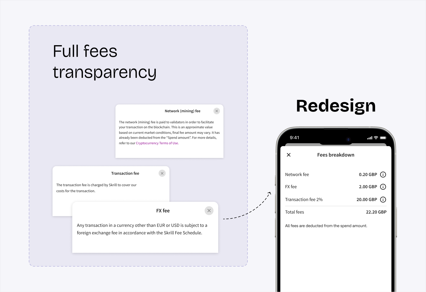
The interface shows either minimum or maximum according to state, avoiding contradictory simultaneous messages.
The existing components could not represent coin and network information together, so I specified a reusable list item across anatomy, branding, states, layout and behaviour.
Depending on the deposit method, part of a user’s balance may be restricted. Because this wasn’t clearly explained, users were left confused and concerned about their funds.
Three How Might We questions focused on problems outside the flow: users needed to know the feature exists, understand what it does and get help part-way through. Each became part of the release, not a recommendation left in a deck.
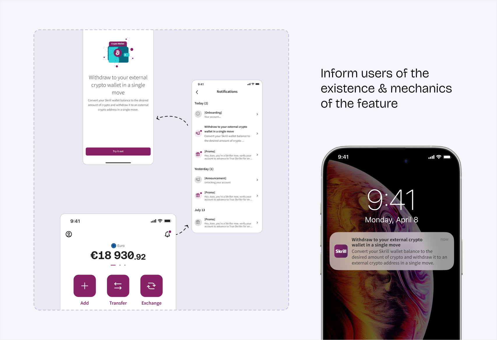
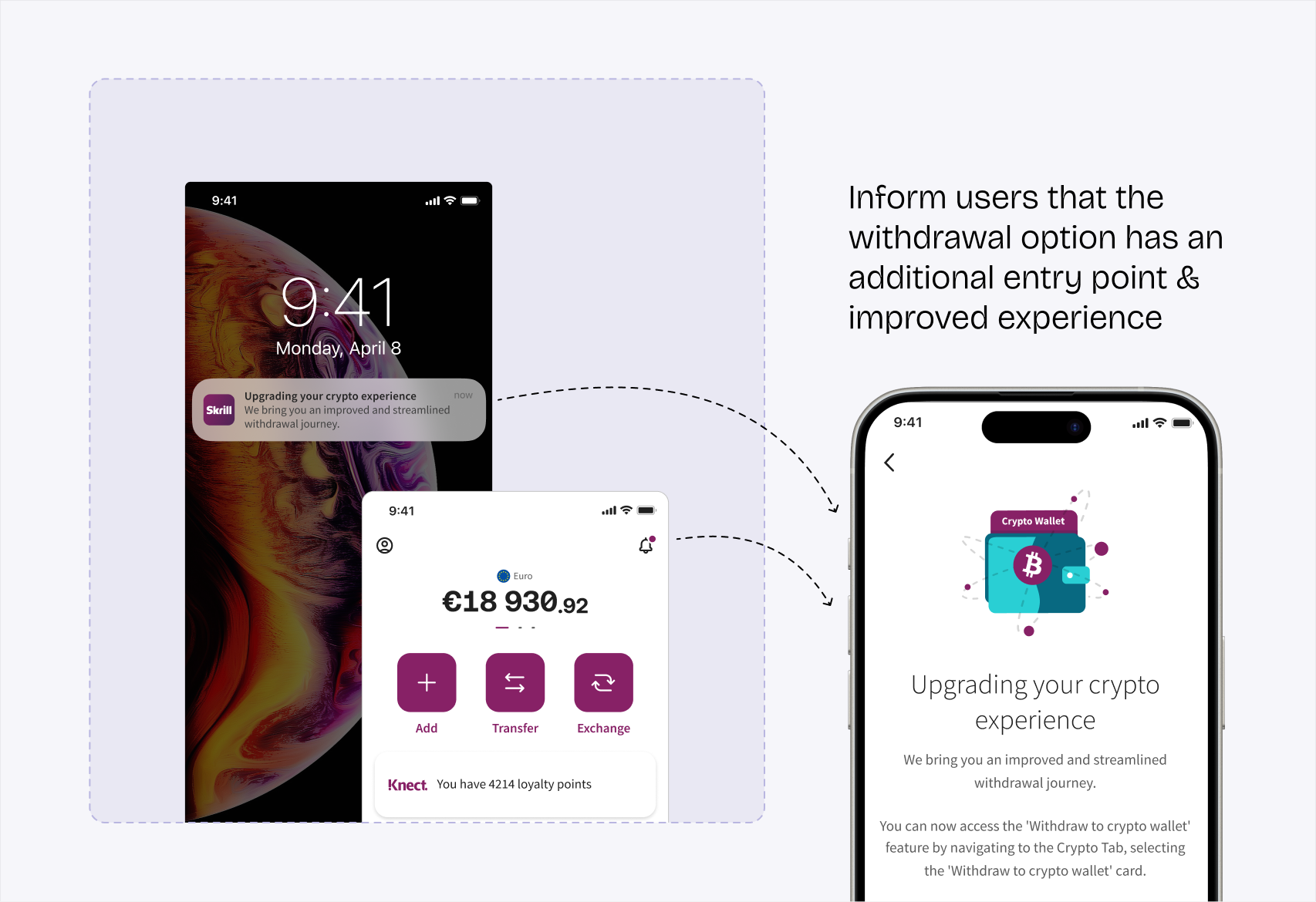
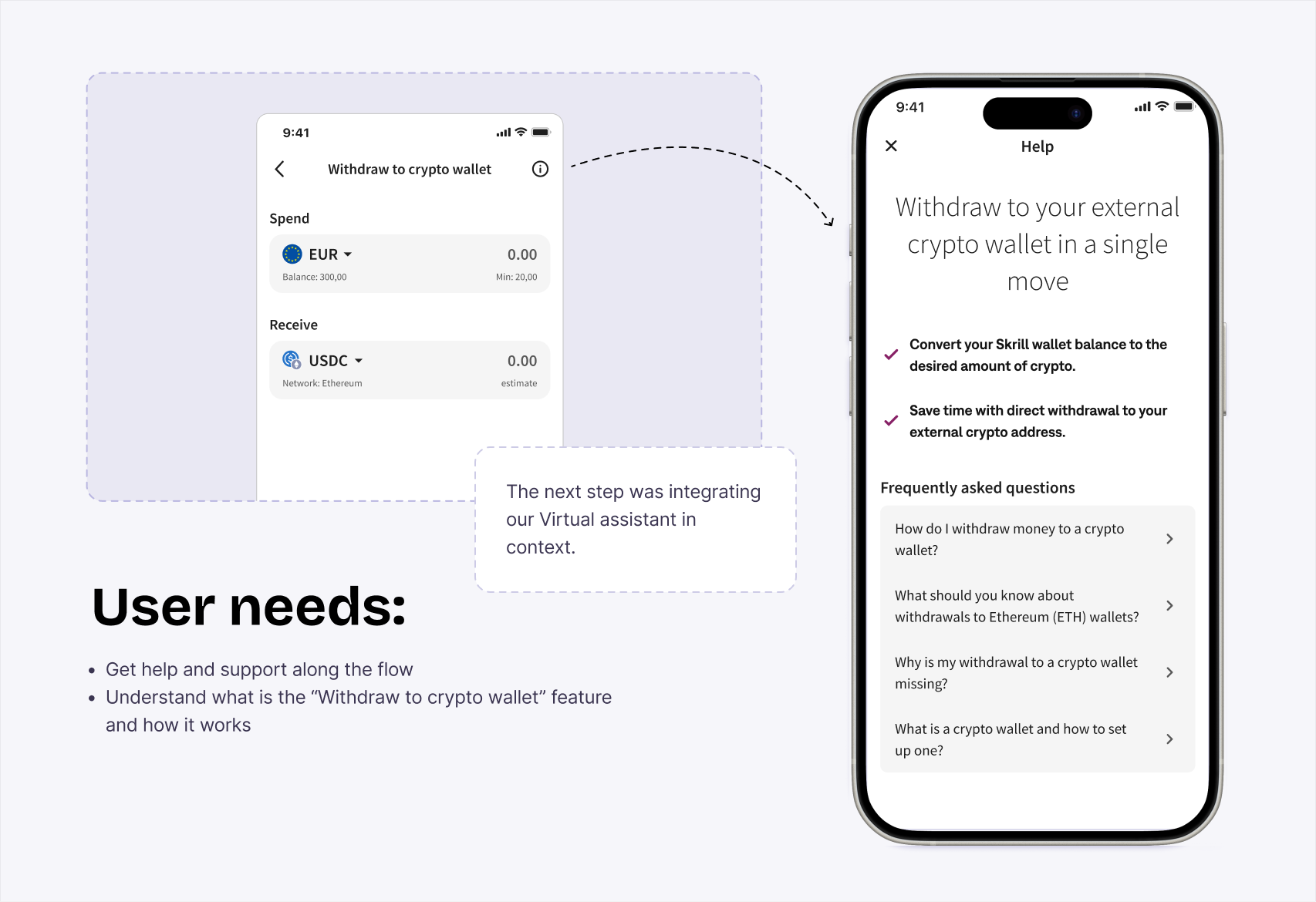
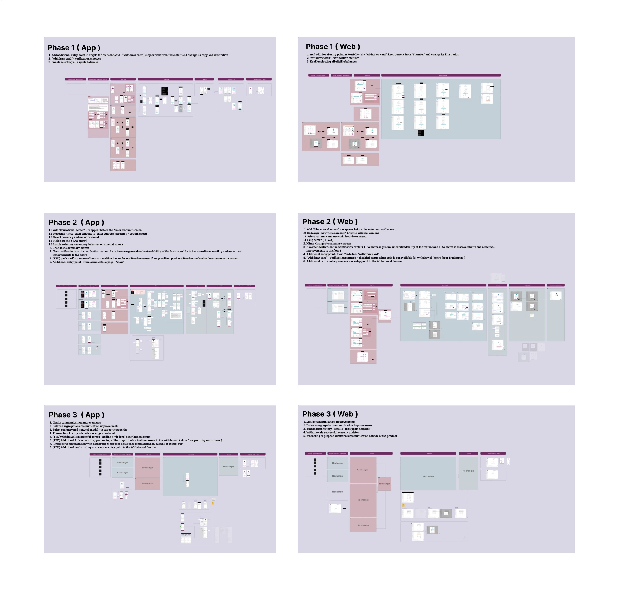
I worked with Product and Engineering to divide the solution into three stages, prioritising user and business impact against effort.
The scope covered search by ticker, coin or network; network identification in the asset list; balance-segregation states; address-field behaviours; verification statuses; and market-specific service states.
The design system did not support the required coin-and-network row, so I specified a reusable component across anatomy, branding, behaviour, states, responsive layout and spacing.
During the quarter after the redesign, first-page landings on Enter amount increased 25%. Monthly withdrawal volume grew from 10K to 15K transactions.
Keep the chain from evidence to prioritised problem to shipped decision visible. It helped different disciplines make trade-offs from the same facts.
The programme was ambitious for the time available. I would reduce workshop exercises and protect more time for the activities most likely to change scope.