Paysafe · Skrill and Neteller · Crypto trading · 2023
Boosting crypto trades by 35% via dashboard redesign
Buy and Sell accounted for 85.6% of crypto transactions, yet neither was accessible from the dashboard. Drawing on transactional and behavioural data, alongside a heuristic evaluation, I redesigned the information hierarchy and shortened the purchase journey. I then tested the solution and partnered with Product and Engineering on a phased release.
Role
Senior Product Designer - sole designer in a cross-functional squad, owning research, product strategy and design end to end.
The dashboard gave equal prominence to low-use features while frequent actions were not present at all.
My contribution
Analyzing quantitative data, heuristic and competitor analysis, IA and flows, interface and component design, usability testing, phased scoping and planning.
Impact
Mobile crypto trades rose 35% in the month after launch, outpacing the unchanged web experience, which grew 18%.
+35%
completed mobile crypto trades in the month after release
6 → 5
screens in the Buy journey after removing a compulsory detour
24
EU and LATAM crypto traders who tested two prototypes before build and successfully performed Buy
01 · The problem
The interface contradicted user behaviour
Buy and Sell quick actions drove 85.6% of transactions but were buried behind coin selection and coin details pages. Meanwhile, four equally weighted dashboard actions included features responsible for just 1 in 75 transactions.
User problem
Time-to-value on a screen where speed is the product
The longer it takes to execute the trade you intended, the less you use the product. In trading, how fast you can get in and out is a large part of why a user picks one provider over another.
Business problem
Friction on the entry screen directly impacts revenue and churn
The dashboard deviated visibly from competitor products, in a category where users hold accounts with several providers and compare them constantly.
Design challenge
Promoting Buy and Sell meant demoting features that were already underperforming
While supporting the “Buy” and “Sell” behaviour for our swing-trader and thrill seeker personas, we risked lowering the performance of recurring orders, important for the Hodler persona. (Despite being on the Crypto dashboard, limit and recurring orders were underperforming).
Current flow - problem space: low discoverability of “Buy” & “Sell” & an additional step, slowing down the “Buy” journey.
02 · Evidence and insight
Several inputs pointed to the same priority: reduce the distance to Buy and Sell
I worked with Product and Analytics to assemble the evidence before proposing a new layout. That shifted the conversation from visual preference to user behaviour and product value.
Transaction data
In the past year instant Buy and Sell accounted for 85.6% of transactions. Recurring buys represented 0.5%; conditional orders 0.8%.
Behavioural analytics
Buy and Sell were already the most-tapped actions on a coin's details page. Around 60% more limit and conditional orders were initiated from the Crypto dashboard than from a coin's details page, showing the effect of first-screen placement. This also showed that users study performance on other platforms before ordering on ours.
Trading frequency
Daily trading rose from 43% among users with up to six months' experience to 74% among those with more than seven years. Repeated friction on the Crypto dashboard was drawing away experienced users.
Heuristic evaluation
I ran a heuristic evaluation across iOS and Android and found multiple issues, including - visibility of system status, unclear action priority, inconsistent terminology and lack of patterns, flexibility and efficiency of use.
Market patterns
I looked at Quick-action patterns, row lengths and naming conventions. Competitor products commonly placed Buy and Sell first, while using secondary menus for lower-frequency features.
Stakeholder input
Three stakeholders interviewed independently about business value prioritised the same two actions.
Personas main Jobs
Primary Buy/Sell buttons provide the critical, instant execution baseline shared by all three personas, while secondary features branch into technical Limit Orders for Swing Traders and automated Recurring Orders for HODLers.
Heuristic evaluation
Twelve issues hiding on one screen
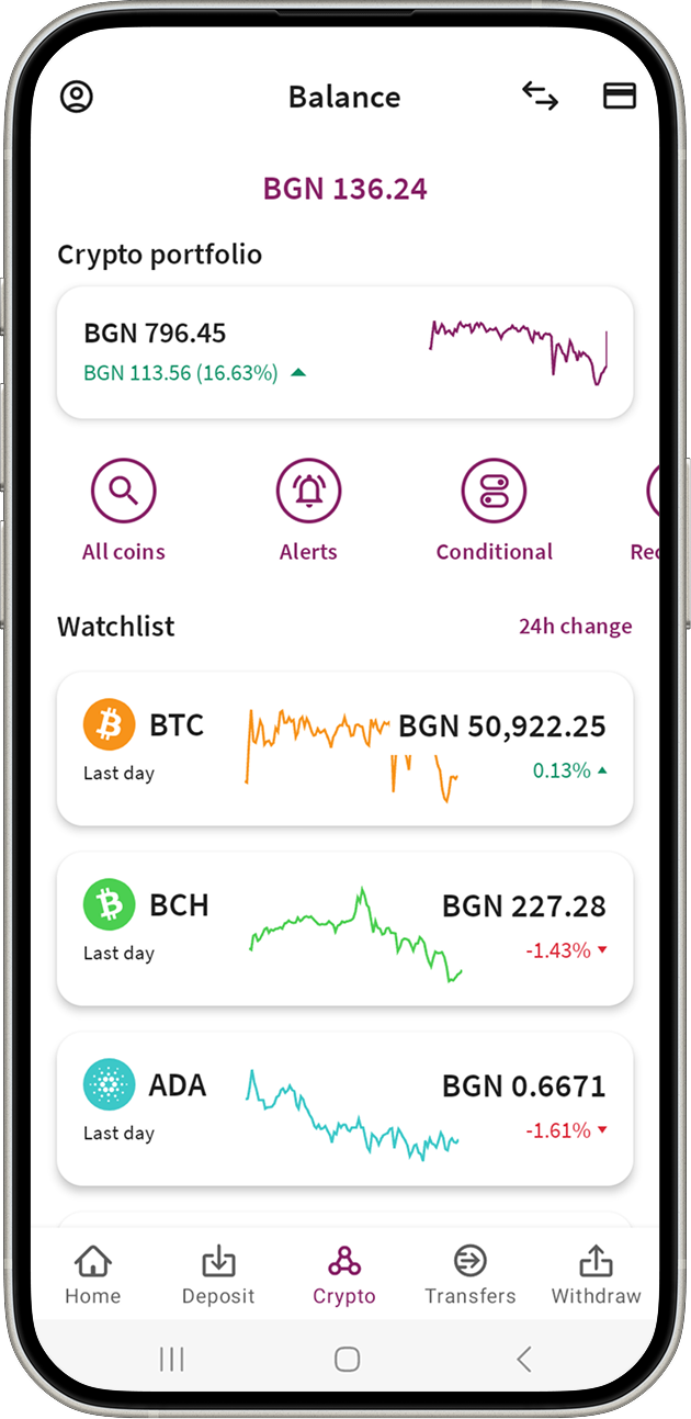
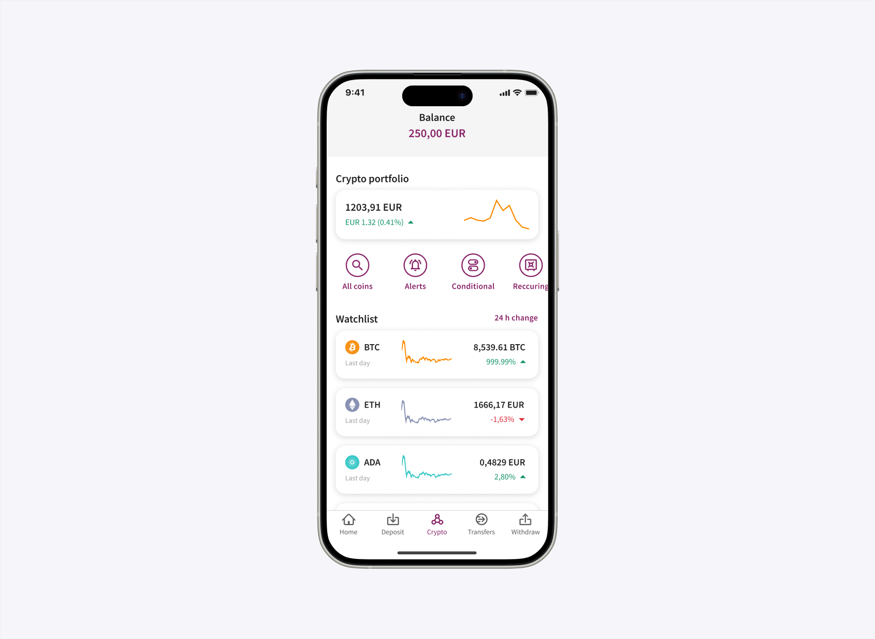
This is how the dashboard appeared on Android before the redesign. Select a marker to see the usability problem, its impact and the Nielsen heuristic it conflicts with.
Issue 01 · Balance header
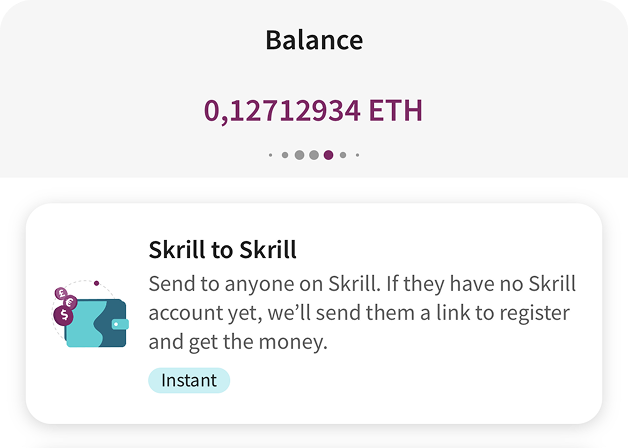
The fiat balance carousel
The prominent fiat balance can be mistaken for the value of the crypto portfolio shown below it.
After a user chooses a crypto balance on the wallet dashboard, the carousel silently switches back to fiat on the crypto tab.
The same control also switches content inside other flows, but on the Crypto dashboard it's a static signifier - so it changes purpose despite looking the same.
Visibility of system status · Match between system and the real world
Issue 02 · Header action
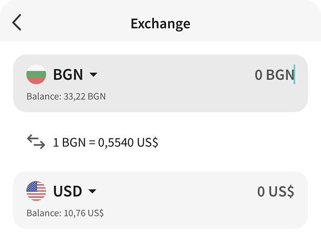
The Exchange entry
The icon opens fiat-to-fiat conversion on a crypto screen, which does not match the user's current context.
Without a text label, users must remember or guess what the symbol means.
Match between system and the real world · Recognition rather than recall
Issue 03 · Header action
The card entry
The card shortcut has no clear relationship to a crypto task on this screen.
Its unlabelled icon competes with more relevant actions.
Aesthetic and minimalist design · Recognition rather than recall
Issue 04 · Crypto portfolio
The portfolio widget
The percentage change and graph do not state their timeframe.
Without that context, users cannot interpret whether the portfolio is rising over a day, week or another period.
Visibility of system status
Issue 05 · Quick actions
The priority of the row
Four visually identical buttons give frequent and infrequent tasks equal prominence.
The row offers no shortcut to the most common trading actions, so experienced users still take the longer route.
Aesthetic and minimalist design · Flexibility and efficiency of use
Issue 06 · Quick actions
“All coins”
A browsing destination sits in a row otherwise used for order types.
This category mismatch makes the row harder to predict from its surrounding actions.
A second visually different button on the same screen - below the watchlist items - leads to the same coin list.
Consistency and standards · Aesthetic and minimalist design
Issue 07 · Quick actions
The fourth button
The fourth action is cropped at common Android widths, obscuring its label and reducing its tap target.
The layout creates an avoidable selection error and shows that the row cannot safely hold four equal actions.
Error prevention · Flexibility and efficiency of use
Issue 08 · Quick actions
“Conditional” and “Recurring”
The same order types use different names on the dashboard and asset details page, and differ again between iOS and Android.
Users have to decide whether several labels refer to the same feature.
Consistency and standards
Issue 09 · Watchlist
Sorting and filtering
The watchlist offers only one sort - 24-hour price change - and no filters.
Users looking for newly listed coins must scan or search instead of narrowing the list.
Flexibility and efficiency of use
Issue 10 · Watchlist
“Last day” on every row
“24h change” and “last day” describe the same period in two ways on the same screen.
Ticker-only rows require users to recall which asset each abbreviation represents.
Consistency and standards · Recognition rather than recall
Issue 11 · Watchlist
The row graphs
Some graphs appear visually broken or inconsistent with the values beside them.
Because users rely on these graphs to read movement at a glance, a misleading trend can lead to a poorly informed trading decision.
Error prevention · Visibility of system status
Issue 12 · Missing primary actions
Buy and Sell are absent
Buy and Sell, which accounted for 85.6% of transactions, are not available from the main crypto screen.
Users must leave the dashboard, choose a coin and open its details before starting the most common trading jobs.
Lower-frequency features receive first-screen access while the dominant tasks remain hidden.
Flexibility and efficiency of use · Match between system and the real world
Key insight
The dashboard should reflect the jobs users perform most - not give every feature equal weight.
This became the release principle: reduce the distance to Buy and Sell, then give advanced actions clear secondary entry points.
Competitor snapshot
Quick-action patterns across the category
Action hierarchy
Buy and Sell consistently came first
01Buy
02Sell
03Swap / Convert
04Deposit
05Withdraw
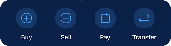
Dashboards most often showed three or four actions, some including a More menu.
Naming patterns
Advanced orders used many different labels
Conditional orders
Limit3
Limit order2
Stop Limit2
Stop order1
Target Price1
Stop loss1
Stop loss limit1
Take profit1
Take profit limit1
Recurring orders
Recurring Buy4
Savings plan1
Recurring1
The competitor review compared action hierarchy, the number of quick actions on dashboards and labels for recurring and conditional orders.
03 · Key design decisions
Three decisions shaped the release.
Each decision tied a user behaviour to a product constraint. The chosen direction improved the main journey while acknowledging what moved out of view.
Decision 01
Prioritise Buy and Sell
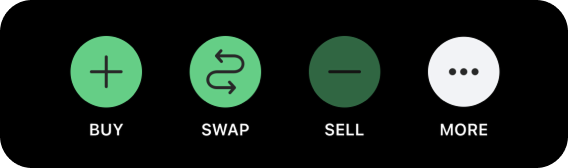
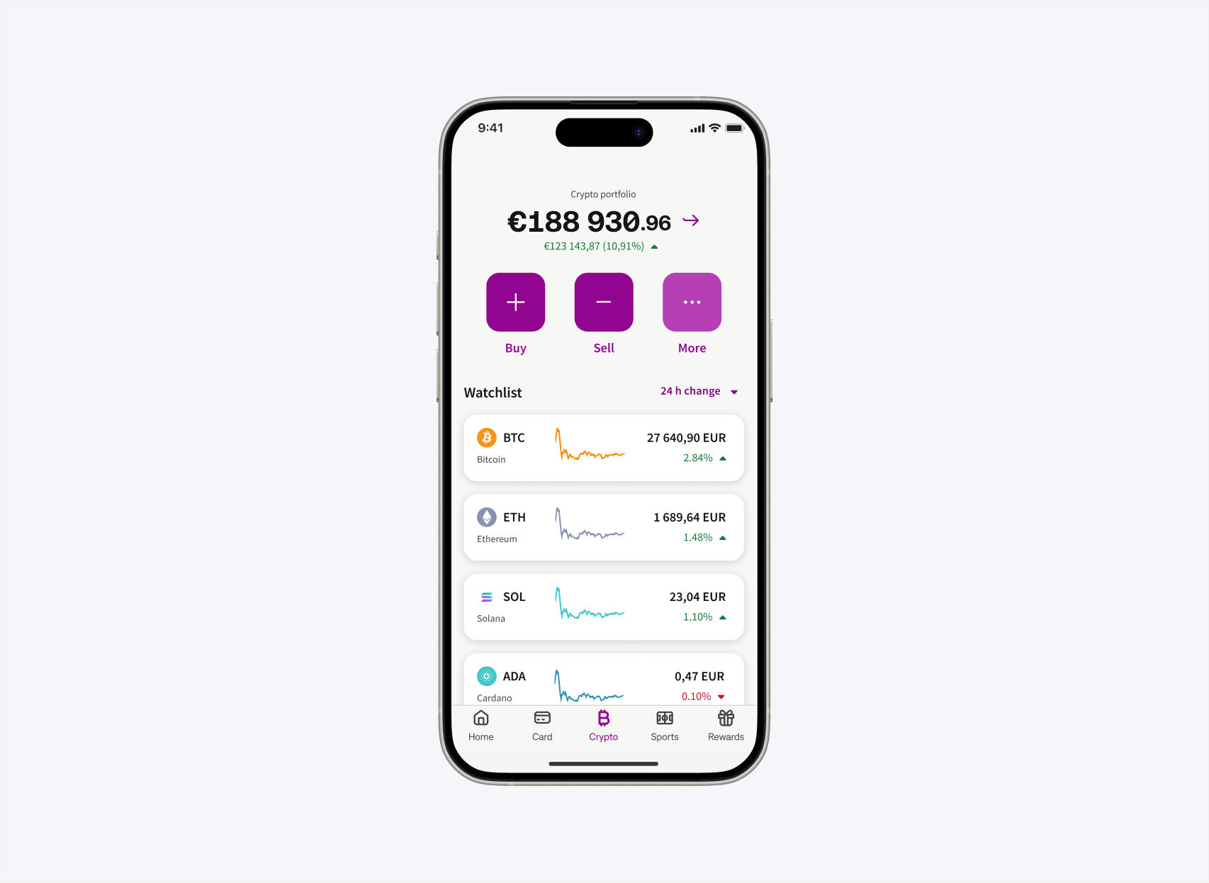
I replaced four equal circular actions with Buy and Sell as primary buttons and More opening the orders and alerts.
Conditional and Recurring orders lost first-screen placement. I added contextual and secondary routes to support these important jobs for our trading personas.
Decision 02
Make coin's details screen optional
Users comparing assets could still open the details page. Users ready to transact could directly Buy.
Why: one less compulsory screen made a frequent task faster without removing useful information.
Decision 03
Offer recurring buy in context
I placed a recurring-buy entry on the instant-purchase success screen, after the user had demonstrated intent and completed a trade.
Evidence: in user testing, this route outperformed both existing recurring-order entry points.
After the redesign: Buy and Sell moved onto the dashboard, More opens the secondary actions with clear naming and descriptions requested by users, coin discovery is unified in one button instead of two, the coin's details page became optional thus shortening the journey, and recurring buy appeared in context - after a completed purchase.
BeforeThe live dashboard
AfterThe redesign
Drag the handle or use the arrow keys to compare
04 · Validation and iteration
All 24 participants completed Buy. Usability testing uncovered additional issues with the trading flows.
Twenty-four crypto traders across the EU and LATAM completed unmoderated sessions with two clickable prototypes. Participants had between six months and more than two years of trading experience.
21 / 24
found their assets through the portfolio widget; all 24 understood the holdings value.
24 / 24
found the new See all coins button, completed Buy, and located price alerts and Send crypto inside More.
Clear winner
the “Recurring buy” label was better understood than the “Savings plan” label, so the release kept the language users understood.
What failed: legacy educational screens caused several participants to abandon recurring-buy and limit-order tasks. I recommended moving explanation behind an information control, so that it doesn't stay in the way of a trading journey. Difficulty finding new coins led to a “Recently added” filter planned for phase 1.2.
05 · Systems and delivery
Ship the core behaviour first. Follow with discoverability refinements.
With Engineering, I split the work so secondary improvements could not delay the strongest change.
Phase 1.1 covered revised Buy and Sell flows, dashboard hierarchy, the More drawer, the recurring-buy success entry, removal of rejected educational screens and watchlist updates.
Phase 1.2 added visible sorting and a Recently added category. I also specified a reusable sortable section header and worked with the Home dashboard team and design-system owner on shared quick-action and portfolio patterns.
06 · Outcome
Significant MoM increase in the number of trades and active users
+35% MoM
Mobile completed trades. While the web, which retained the old dashboard, increased 18% over the same period.
8.16% MoM
Increase in mobile active users (Android + iOS) in comparison to the unchanged Web having 0.2% MoM increase.
System value
Reusable set of quick-action buttons, new portfolio and balance widgets and sortable-header patterns contributed to the Global Design System.
What I would repeat
Use targeted research and prioritisation to fit the strongest change into an active roadmap. Phasing kept secondary work from delaying it.
What remains unresolved
Personalised actions may better serve our different trading personas, but that direction needs its own discovery and validation cycle.