Local entity
BRL wallet
Pix, local deposits and withdrawals, and licensed local merchant payments.
Paysafe became a licensed Payment Institution in Brazil, allowing users to hold BRL and pay with Pix. However, the Central Bank required local and international funds to sit in separate legal entities without free movement between them. I led the UX across onboarding, verification, Pix payments and management, exchange, crypto, P2P and migration, to maintain a seamless experience under one app and login. When plan A turned out too complex to develop ahead of the regulatory deadline, I reshaped the experience into a scoped MVP, designing a frictionless flow driven by conditional visibility, preventative messaging, and clear next actions that guided users around backend friction before it impacted the experience.
Paysafe’s onshore expansion added a local BRL account and Pix alongside the existing international account. The Central Bank of Brazil framework required these assets to stay separate. Users still saw one brand and one login, but their balances could not be used interchangeably. The design had to make that boundary clear without making users learn the legal structure.
Pix, local deposits and withdrawals, and licensed local merchant payments.
Foreign-currency balances, international services and crypto.
If BRL cannot buy crypto, or USD cannot go out through Pix, users only find out at the final step, with a failed transaction and money that looks frozen.
The licence opened BRL, Pix and licensed betting merchants. Missing the regulator's date meant stopping operations in Brazil. Every failed cross-entity transaction would turn into a support contact and lost trust.
The wall lived in the backend and in the regulation. It had to show up in the interface clearly enough to prevent errors, without making Skrill feel like two separate apps and without frustrating returning users.
Pix is the everyday way Brazilians pay, and they already have strong expectations of how it works. I needed to know those expectations before deciding where each feature lived, how the payment journey should work and what would make it feel local.
Users will not learn our legal structure. The interface has to know it for them
Every flow needed to know which entity it belonged to before the user started it. That became the principle for the whole release: prevent, don't explain afterwards.
My first proposal tied the home screen to the balance carousel. Swiping from BRL to USD (or a foreign currency balance) would change features, quick actions and content modules to what that entity can provide.
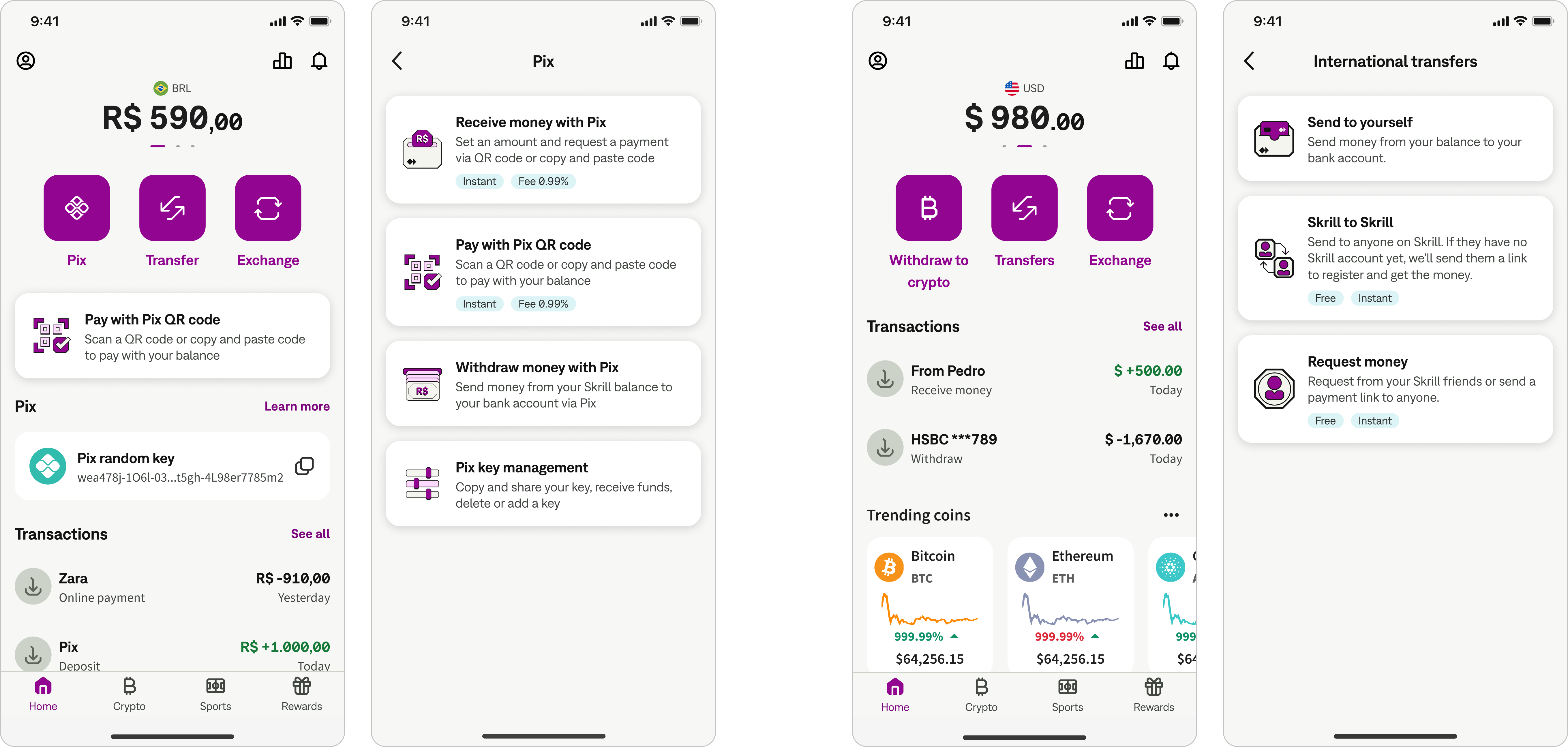
When a user switches to USD (or a foreign currency balance), they’ll never see Pix, so they cannot start a transfer the regulation will block.
Swiping between balances is standard in wallets. Users don't need to learn a new two-account taxonomy.
The BRL view feels like everyday Brazilian banking, the USD view feels global. The separation is felt, not explained.
In technical grooming, Engineering showed that a fully state-driven dashboard would delay launch by several months. The launch date was not negotiable: missing it meant shutting down in Brazil. We pivoted to a scoped MVP with one shared dashboard.
That created the exact risk the initial proposal was meant to remove. With one dashboard, a user on the foreign currency balance could tap Transfer, pick Pix, and only then discover it cannot work.
I moved the protection from the structure of the app into every flow.
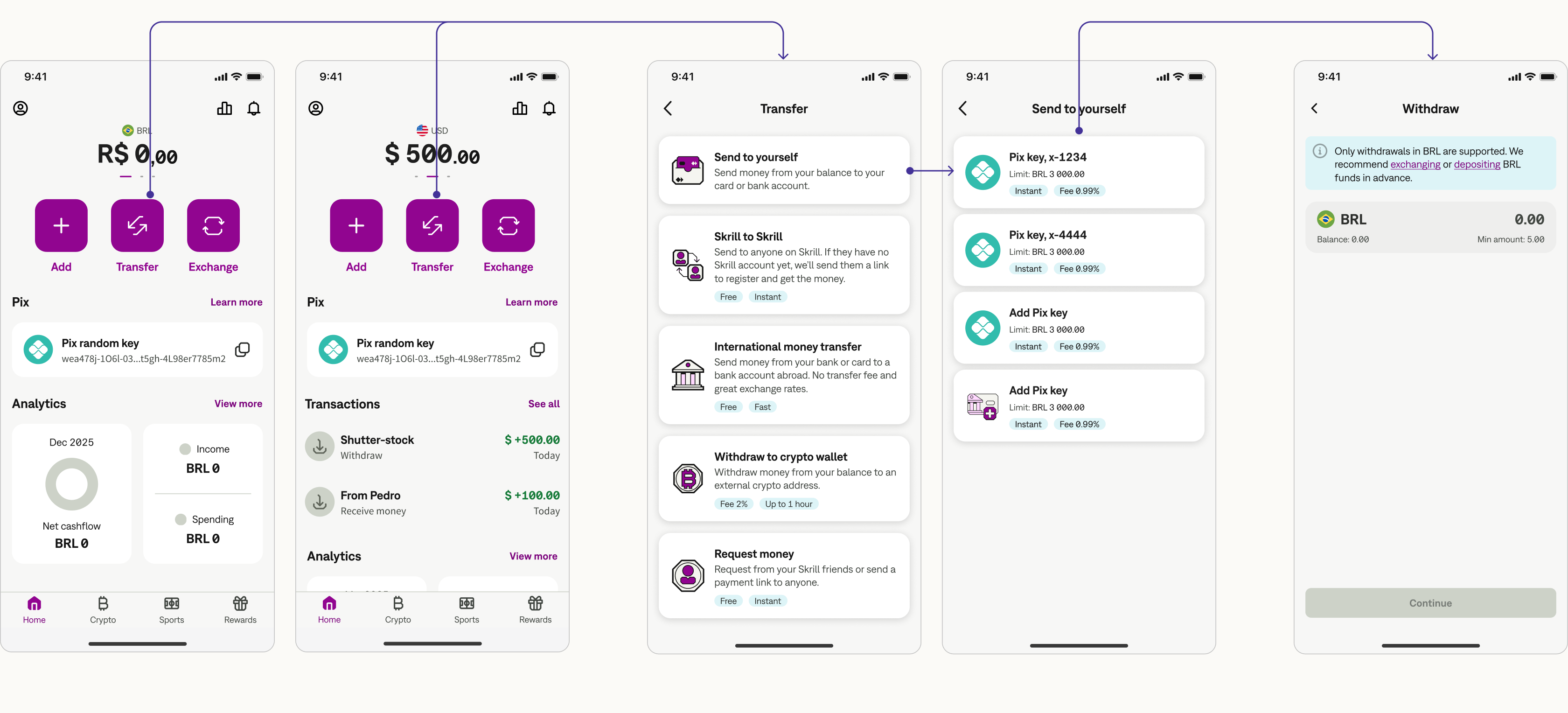
If a currency or payment method was not allowed in the context of that entity, it got hidden or disabled before a user invested effort in a journey.
Why: prevention reduced the need to explain a failure after the fact or manage CS contacts.
A short message at the start of the flow, when the user reached actions affected by the two-entity model, not an error screen at the end of it.
Why: users could get the needed support and information at the point of contact with the issue, avoiding tedious out-of-context explanations during onboarding.
Every message links to what the user can do instead of being stuck at that step of the journey: exchange, transfer money through a merchant or use the right account.
Why: allowing payment flows to hit a dead end would cause massive user drop-off and risk complete abandonment of the app.
The Brazilian entity needs more data before it can open an account. Existing international users also needed a way into the new model without losing trust in money they already held.
My proposal let new users look around before giving all the regulatory data, to protect sign-up conversion.
Cut: the timeline forced a strict gate upfront, before users see any value.
I designed the full verification funnel for the data the Central Bank requires: CPF tax ID, how the user intends to use the wallet and their estimated monthly income.
Migration for the existing users was voluntary. I worked with Customer Support on FAQ topics, education pages and emails covering benefits and limitations, so users could decide whether they'd transition, knowing what changes.
My role was to mentor another designer and further iterate on the payment flows. I designed an additional communication layer to clarify the limitations between BRL and international accounts, while streamlining and simplifying the overall payment journeys to align with local users’ mental models. Additionally, I designed the payment details, scanning errors, and error recovery states. Finally, I architected the comprehensive Pix payments hub (the "Plan A" mentioned above), which we strategically replaced with in-flow guardrails to meet our strict regulatory timeframes.
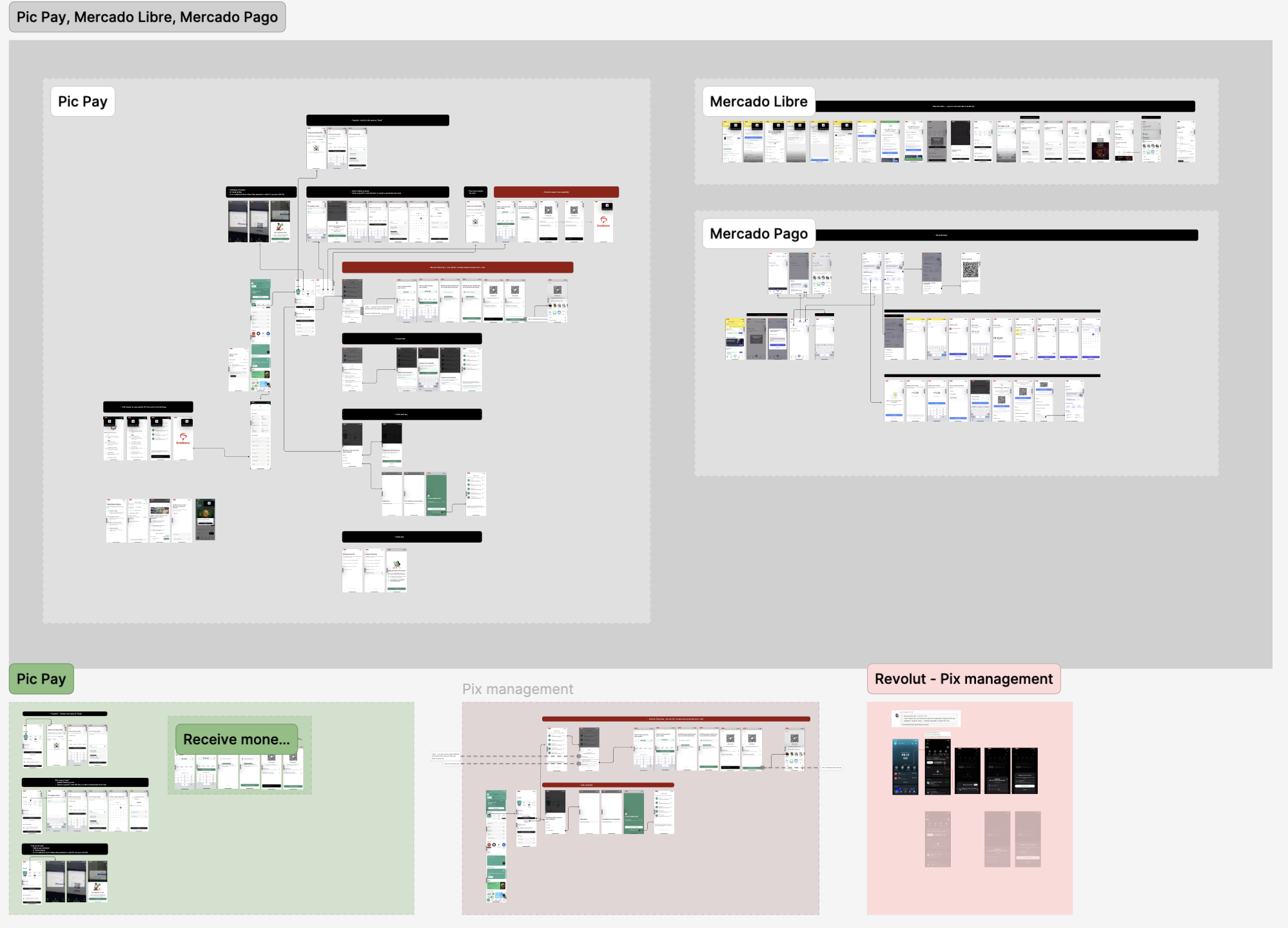
The competitor review showed how local apps name QR payments. The label covers both scanning and copy and paste, which Brazilians use for online checkout.
While Pix normally allows anyone to send you money, our initial release only supported deposits from accounts under the user's own name. I integrated explicit messaging right at the payment method selection to prevent users from sharing unusable codes.
Since Pix deposits and withdrawals operate strictly in BRL, users with a USD balance are alerted on this currency restriction at the very beginning of the flow. The interface immediately provides clear next actions.
Pix QR codes are Brazil’s dominant payment method, powering both physical in-store and virtual POS transactions. To match native speed and expectations, I designed a streamlined flow that resolved critical edge cases. This involved aligning the UI structure with local naming conventions, mapping journeys for both static (manual amount) and dynamic (pre-loaded amount) codes, and designing clear recovery states for insufficient funds, entry errors, and expired codes.
Pix is Brazil’s dominant method for funding digital wallets, traditionally allowing instant transfers from a user's own bank or from third-party accounts. However, our initial release deviated from this standard behavior by restricting inflows strictly to accounts matching the user’s legal name. To reconcile this technical constraint with local mental models, I implemented proactive guardrails directly at the payment method selection screen. This upfront communication managed user expectations, saved time, and successfully intercepted failed transaction errors before they occurred.
To meet local expectations, I designed a Pix Keys Management area allowing users to view, copy, share, name, receive from and delete their keys. To maximize efficiency, I placed the most high-frequency actions on the Home screen within a dedicated widget.
The timeline cut key management to the basics: a random key users could copy, add or delete. Testing later showed users wanted the parts we cut.
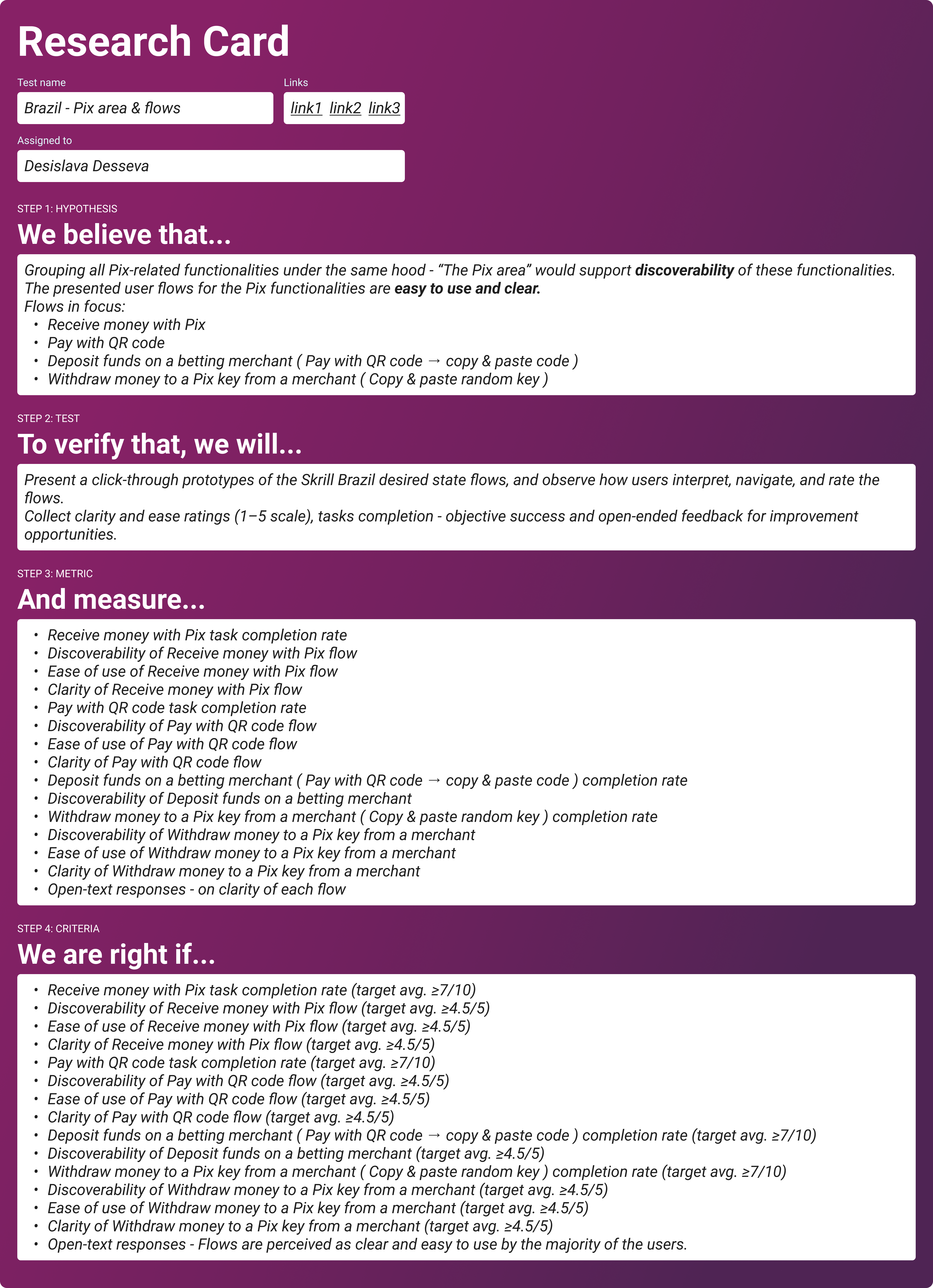
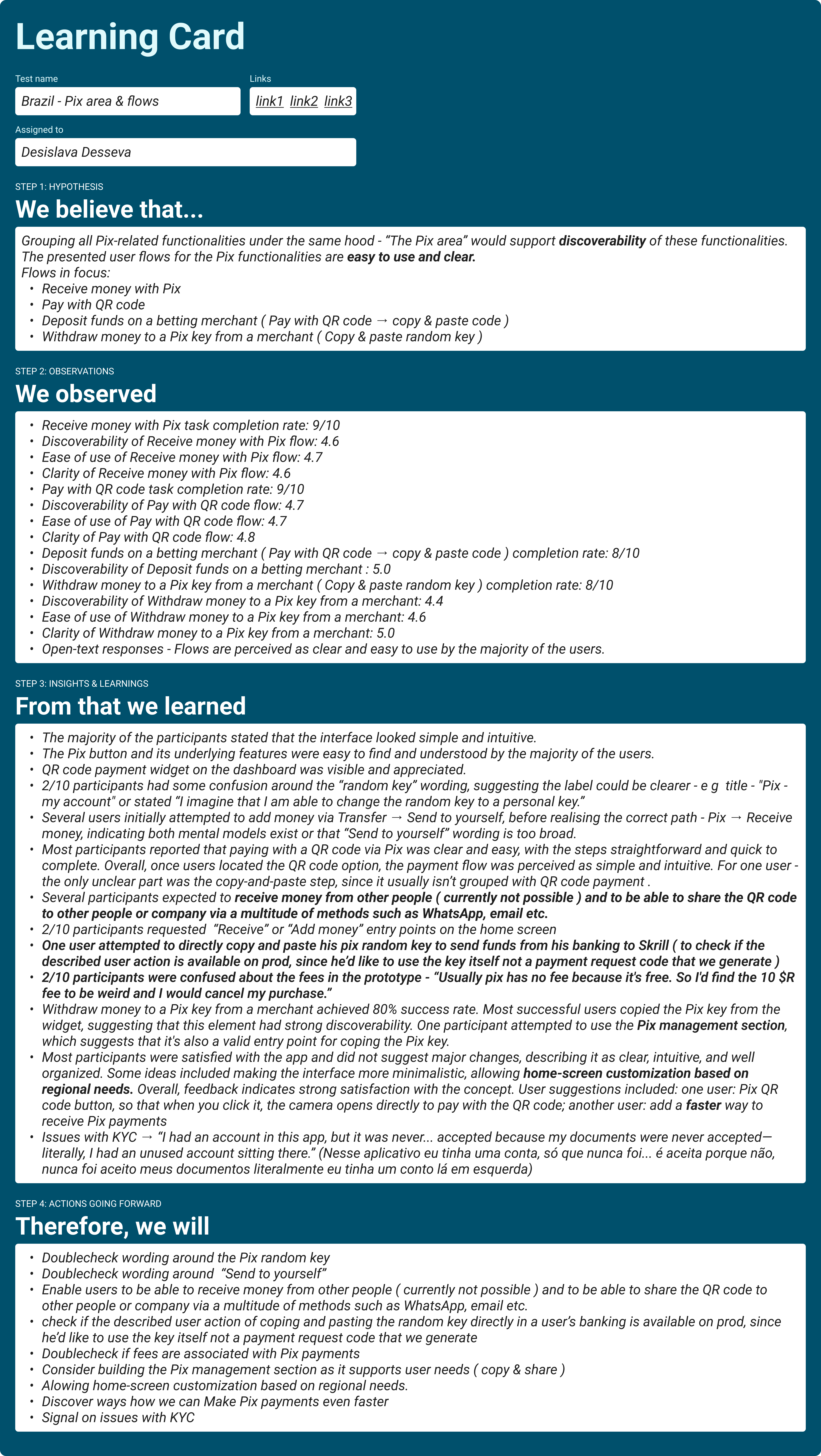
I tested the Pix area with ten Brazilian Pix users in remote sessions on Userlytics, including three sports bettors. Four sessions ran in Portuguese. The hypothesis: one Pix area makes these features easy to find, and the flows are clear. Targets were 7/10 completion and 4.5/5 for discoverability, ease and clarity.
Exchange was the only legal way for users with local currency to transact with foreign currency and vice versa, with the IOF tax applying to every transaction. Crypto sits entirely on the international side and is one of the primary flows utilizing this Exchange functionality.
The Tax on Financial Transactions (IOF) remained visible at the point of entering the amount, with a clear explanation distinguishing between the 3.5% tax for converting BRL to foreign currency and the 0.38% tax for converting foreign currency back to BRL.
When a user enters Trading or chooses to Withdraw to a crypto wallet, they are warned that their BRL balance cannot be used for crypto transactions and are immediately offered the next best actions.
Users holding only BRL balances get a dedicated info screen highlighting the two possible routes: convert BRL to USD, or receive USD from a merchant directly into their wallet.
Content creators in Brazil get paid in USD, for example from Adobe Stock, but Pix only sends BRL. I tested two prototypes with four creators: in Flow 1 the exchange happens inside the withdrawal, in Flow 2 the user leaves to exchange, then comes back.
Flow 2 shipped for launch: the withdrawal states that only BRL is supported and links straight to Exchange. [ASK: what made Flow 2 the launch choice, for example engineering effort?] Flow 1 is on the roadmap, and the test told us what it needs first: show the conversion and fees at the amount step, not only on the summary. One participant also thought Flow 2 was cheaper because only the withdrawal fee showed, so Flow 2 needs the full cost visible too.
Migration was voluntary, so for a long time some users were on the new dual-entity model and some were not. Skrill to Skrill had to work between them without a single failed transfer.
I mapped six scenarios by each person's migration status and the selected currency. For transfers on the international side, the app preselected a funded balance in that currency, or fell back to the funded primary international balance.
| Sender → recipient · currency | What the user sees | Why |
|---|---|---|
| Migrated → migrated · BRL | BRL balance selected | Both use the Brazilian entity; local → local. |
| Migrated → migrated · non-BRL | International balance | Both use the international entity; international → international. |
| Migrated → not migrated · non-BRL | BRL unavailable | The recipient has no Brazilian account; the transfer stays international → international. |
| Not migrated → migrated · BRL | International balance | Even in BRL, the unmigrated sender transfers international → international. |
| Not migrated → migrated · non-BRL | International balance | The transfer stays international → international. |
| Not migrated → not migrated · any currency | International balance | Neither user has migrated; international → international. |
The design proposals connected each UX decision to an expected behaviour change. Local Pix flows aimed to shorten time to first transaction and encourage repeat use. Preventative guardrails aimed to reduce failed attempts and support contacts. Upfront IOF disclosure aimed to reduce exchange abandonment. Live figures are confidential, so these are the expected shifts the release was designed to move, alongside what testing showed.
Map your legal and entity rules before sketching a single screen. Securing early stakeholder alignment on these backend rules is a practice I will always repeat to keep projects on track.
Run every local test in Portuguese from the start. The one participant who struggled most did so with the English prototype, not with the flows.
