Back pain is one of the most common reasons people visit a doctor or miss work, and sedentary work is one of its leading drivers.
To address this I worked with Dynaback’s engineers and data scientists on a mobile app for a wearable device focused on spinal health and movement. The product is a sensor t-shirt: an array of sensors captures how the body moves, processes the readings, and sends them to the phone over Bluetooth. The app turns that stream into real-time haptic and on-screen feedback, short exercise programmes, sessions with physiotherapists, and analytics.
Additionally:
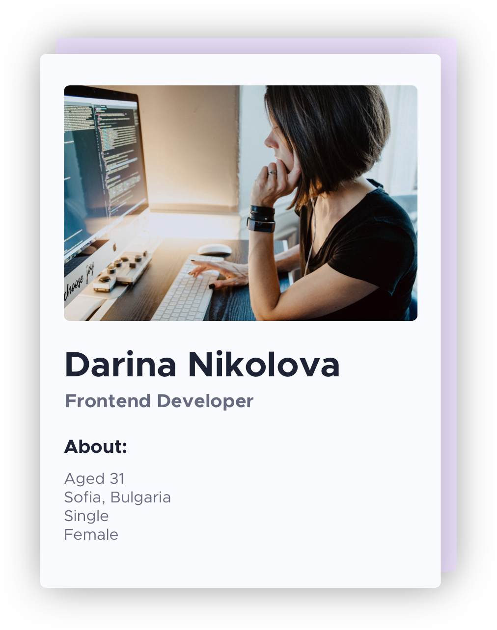
A proto-persona: assembled from the desk research above rather than from interviews, and used as a working hypothesis. The moderated usability sessions further down this page are where it was tested - and where two of its assumptions (that calibration would feel trivial, and that sign-up could come first) turned out to be wrong.
Darina moved from web design into frontend development just over a year ago and is still proving the switch was right - she volunteers for the harder tickets and regularly works past 9pm. She codes eight to ten hours a day in the same position. By mid-afternoon there is a familiar tightness between her shoulder blades and a drop in focus she pushes through with coffee and a break she keeps postponing. She has seen a physiotherapist twice and stopped both times after two appointments: the only slots were mid-afternoon and each one cost her half a working day. She already tracks other parts of her life - runs, sleep, ten minutes of meditation most mornings - and trusts a tool more when it can show her the data behind its advice.
∙Advanced. Writes code daily, configures her own tooling, reads changelogs. Pairing a Bluetooth device is not the barrier - patience with setup that doesn’t explain itself is.
∙Strava (runs, 3× a week), Apple Health, Headspace, Google Calendar, Spotify, Duolingo. She pays for two of them - the two that show her a trend over time.
“I know I should get up more often. But when I’ve finally got the problem in my head at 4pm, stopping for fifteen minutes feels more expensive than the back pain.”
As a developer who codes eight hours a day at the same desk, I want to be told the moment my posture slips and given something short enough that I’ll actually do it, so that I get through the afternoon without stiffness and without breaking my focus.
1. Improve my wellbeing and spinal health - better concentration, less back pain, neck stiffness and headaches
2. Results that last
3. Prevent back pain, stiffness and poor posture day to day
4. Track progress daily, weekly, monthly
5. Relieve back pain and stiffness without spending money or a working day on it
6. Reach a professional for advice on my specific problem
1. A returning user base
2. Subscription revenue
3. Sales of the Dynaback t-shirt
4. Credibility - the product makes health claims and has to be trusted to make them
1. Real-time preventive feedback, analytics, short training sessions and access to professional advice
2. Habit-forming through goal-setting tied to the movement the sensor already measures
3. Posture and movement tracked in real time
4. Analytics screen - hourly, daily, weekly, monthly
5. Short training sessions (15 minutes maximum) that fit a working day, free at launch, plus a first consultation at no cost
6. A vetted directory of professionals, searchable by location and specialism
1. Build the user base by giving the core value away - posture tracking and notifications work without an account
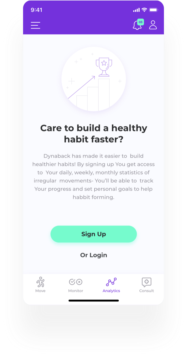
2. Analytics and goal-setting sit behind sign-up. The trade is deliberate: it is the strongest reason to register, and it is also why the first run demonstrates less than it could
3. CTAs and the free training sessions carry the value proposition rather than a countdown or a discount
4. Brand identity, tone of voice and landing page carry the credibility a health claim needs
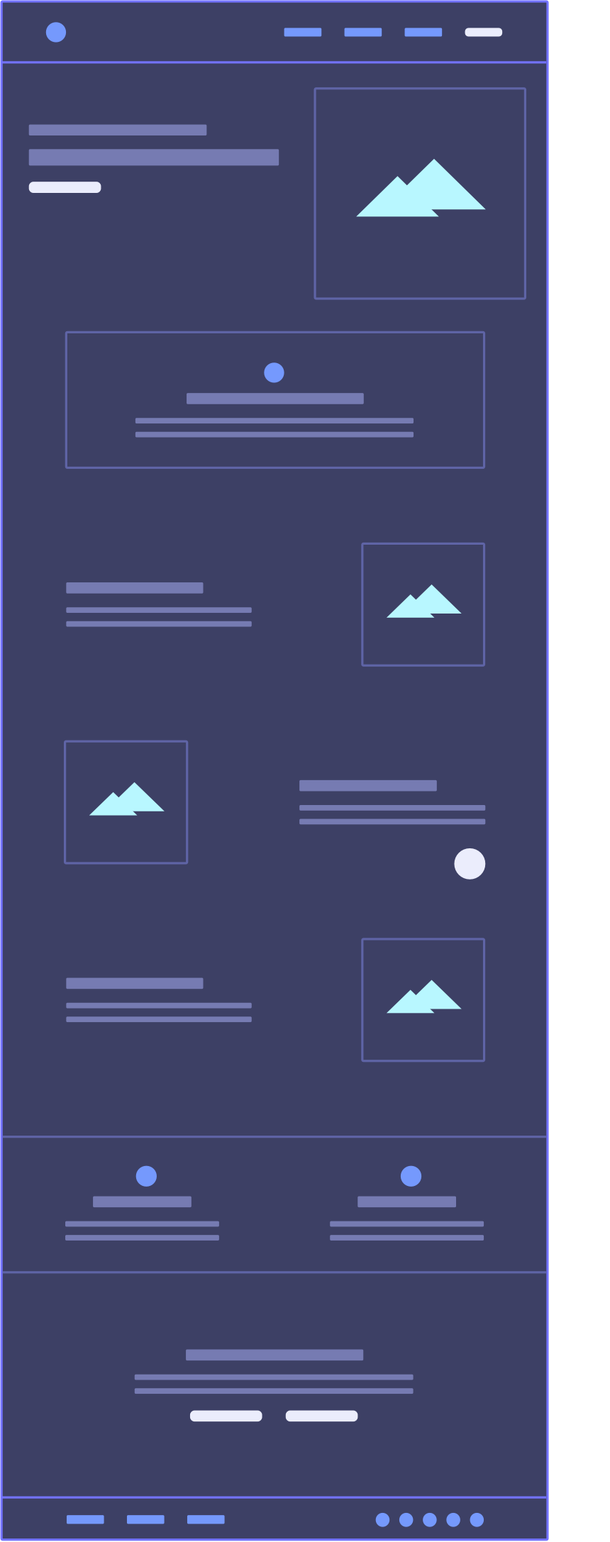
01. Navigation, with fast access to login
02. Hero section. What we do and how we help, in one sentence. Primary CTA - “Try the demo”. Animated illustration behind it carrying the idea.
03. What makes the product different, and what it changes about the working day.
04. Main features and how they bring value to the customers. Animated illustrations describing the use cases.
05. A support chatbot, sticky.
06. Who is it for? The target groups, and the benefit that lands for each.
07. Why to try the product. Primary CTA - “Try the demo”; secondary - “Contact us”.
08. Footer - contact details, social links and newsletter sign-up.
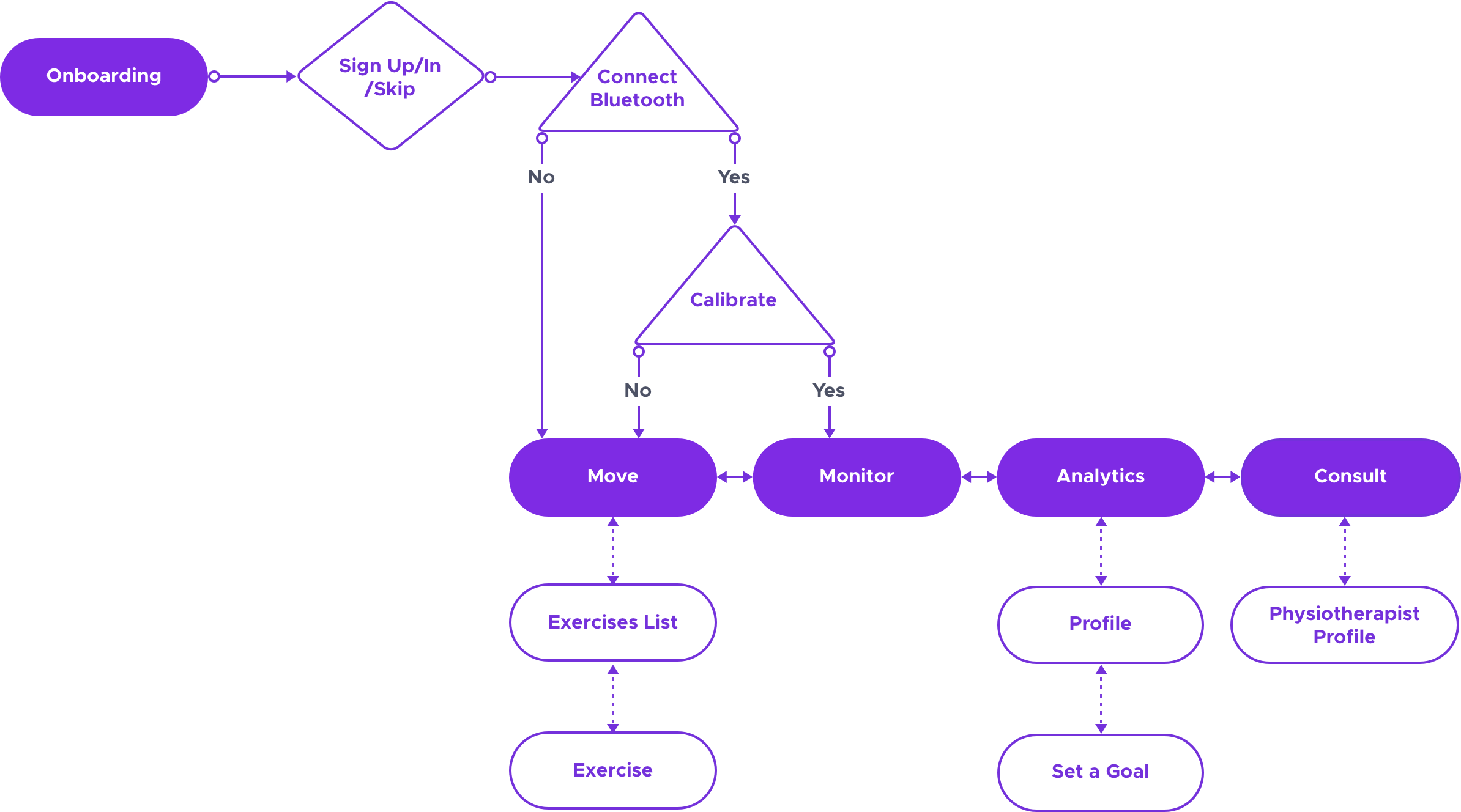
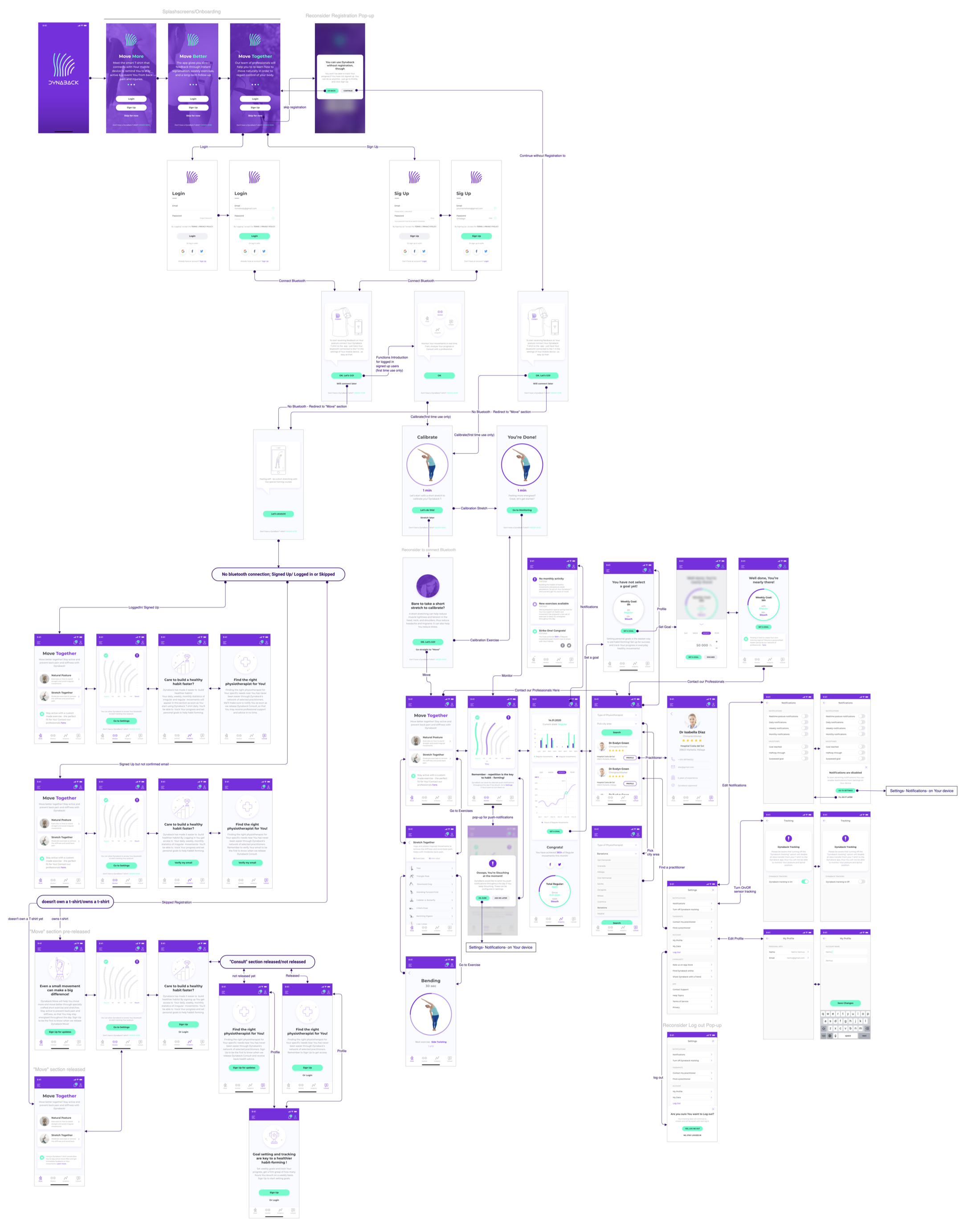
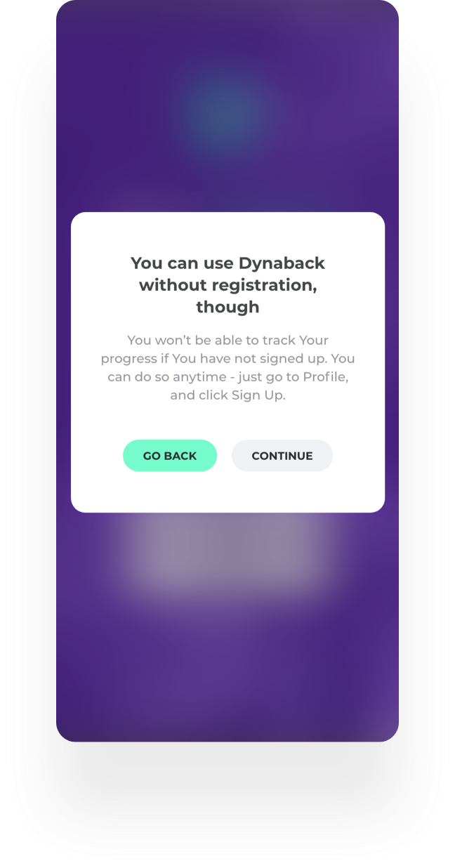
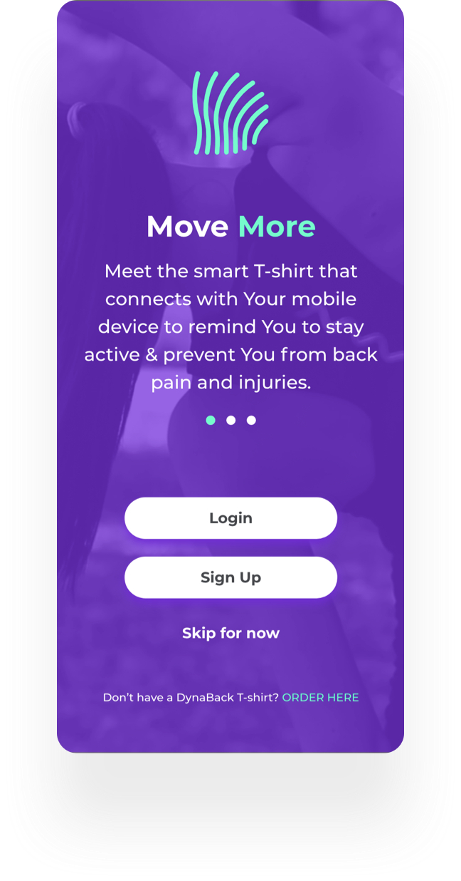
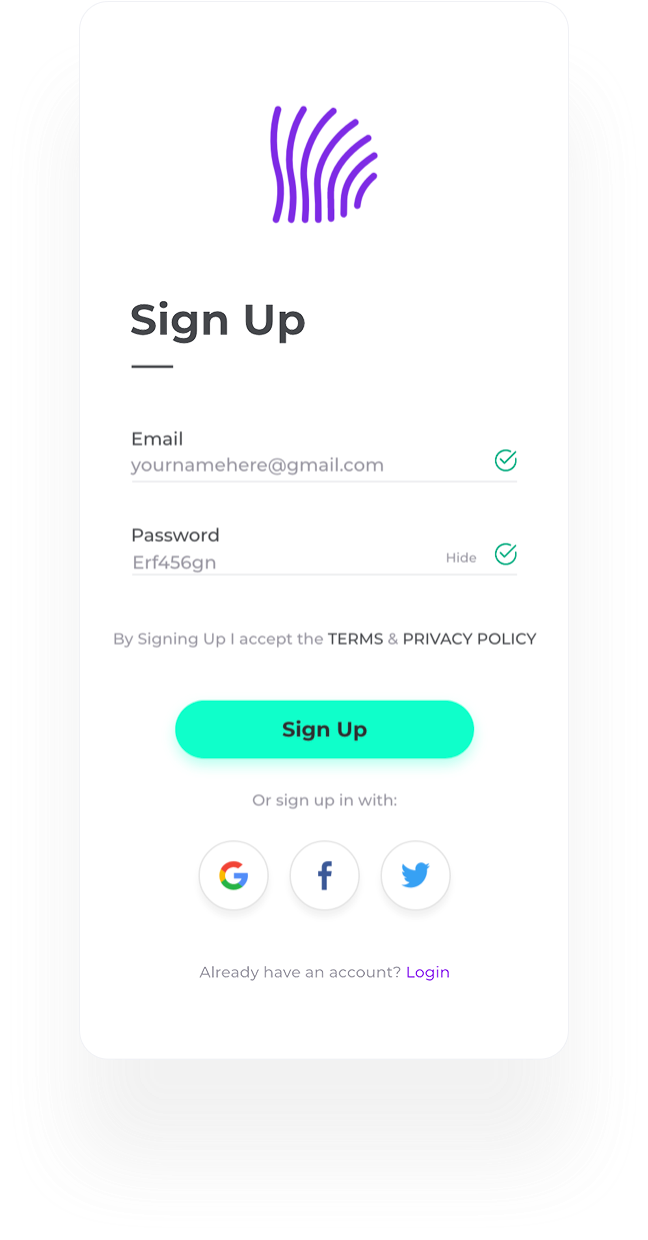
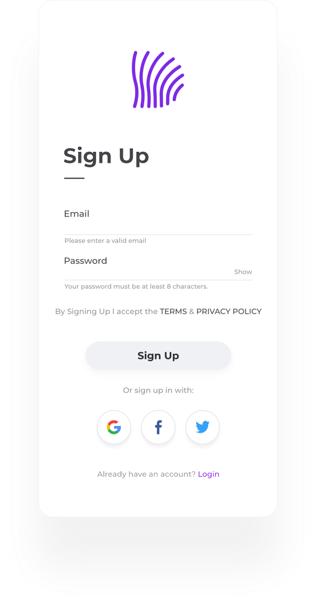
Choosing “not now” brings up a short explanation of what an account adds. Posture tracking works without registration; analytics and goals do not. Testing later pushed this decision further than it had gone here - sign-up moved out of the first run altogether.

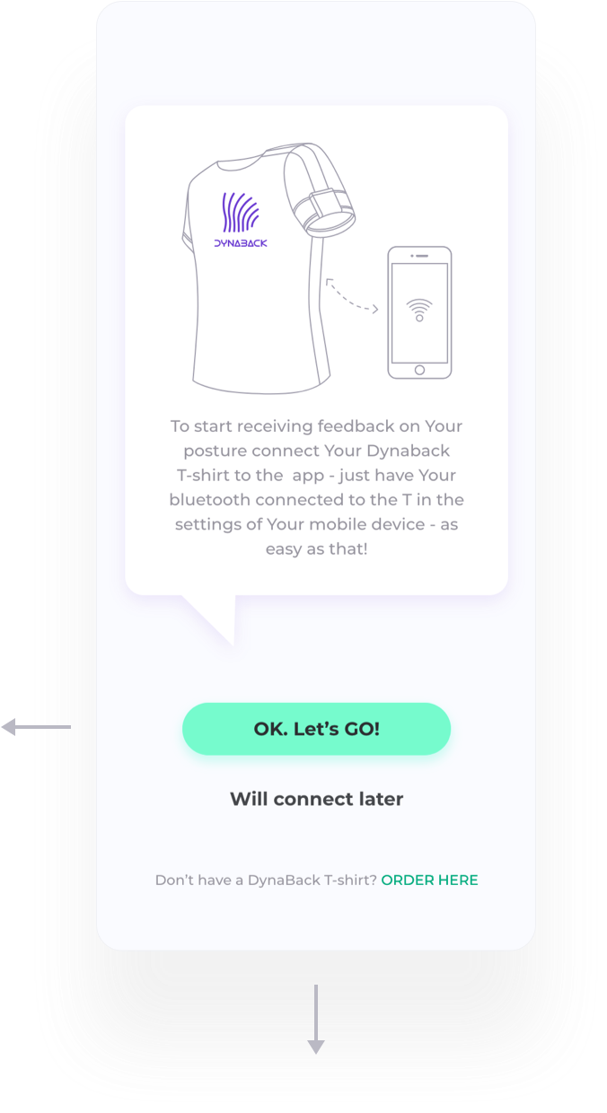
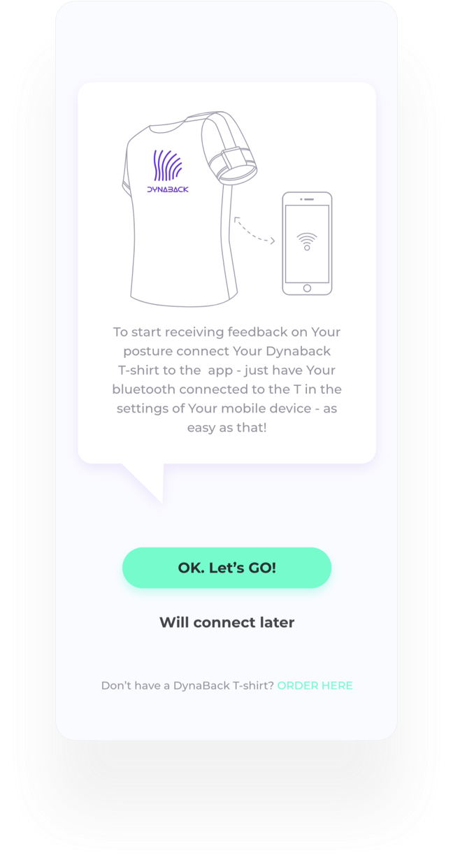
01. A custom Bluetooth permission screen ahead of the system dialog. The reason for the request is made before the OS asks the question - the system prompt allows one line and no second attempt.
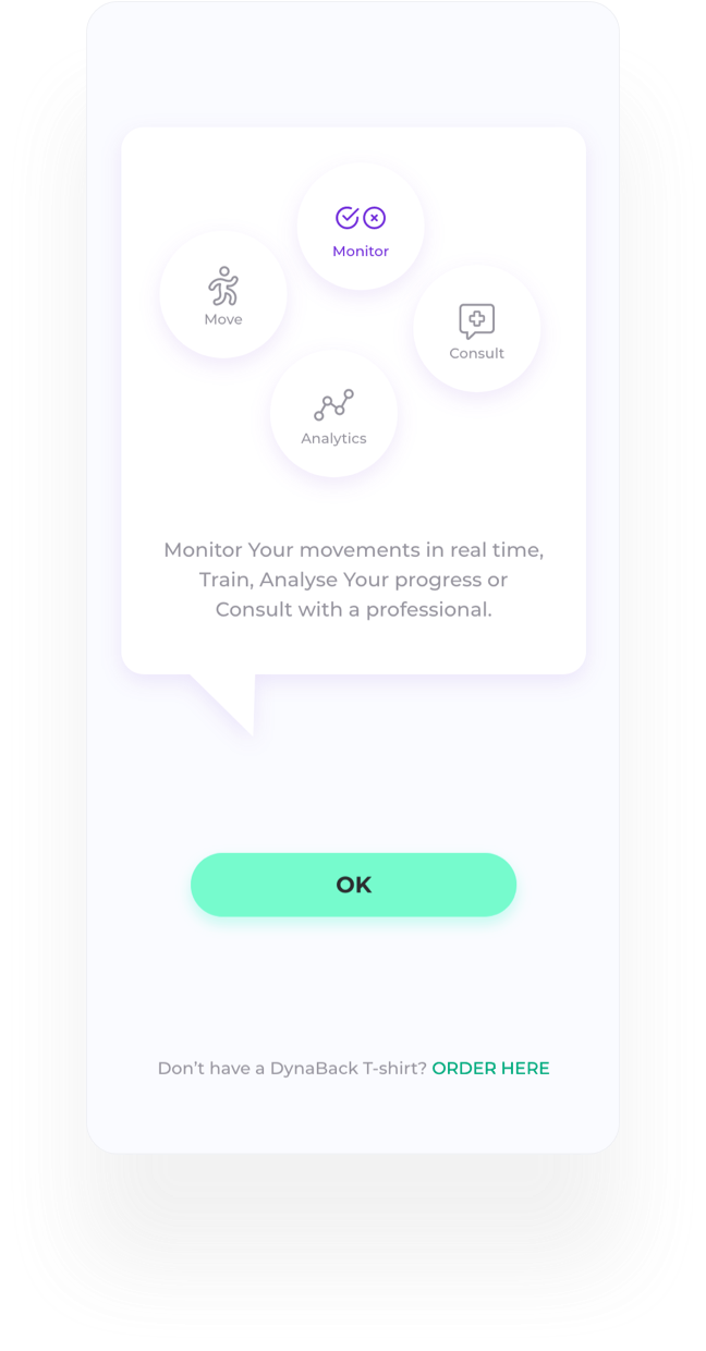
02. A short functions introduction, shown only to first-time signed-in users.
03. If Bluetooth access is refused, the user is routed to the “Move” section, which works without the hardware, rather than into a dead end.
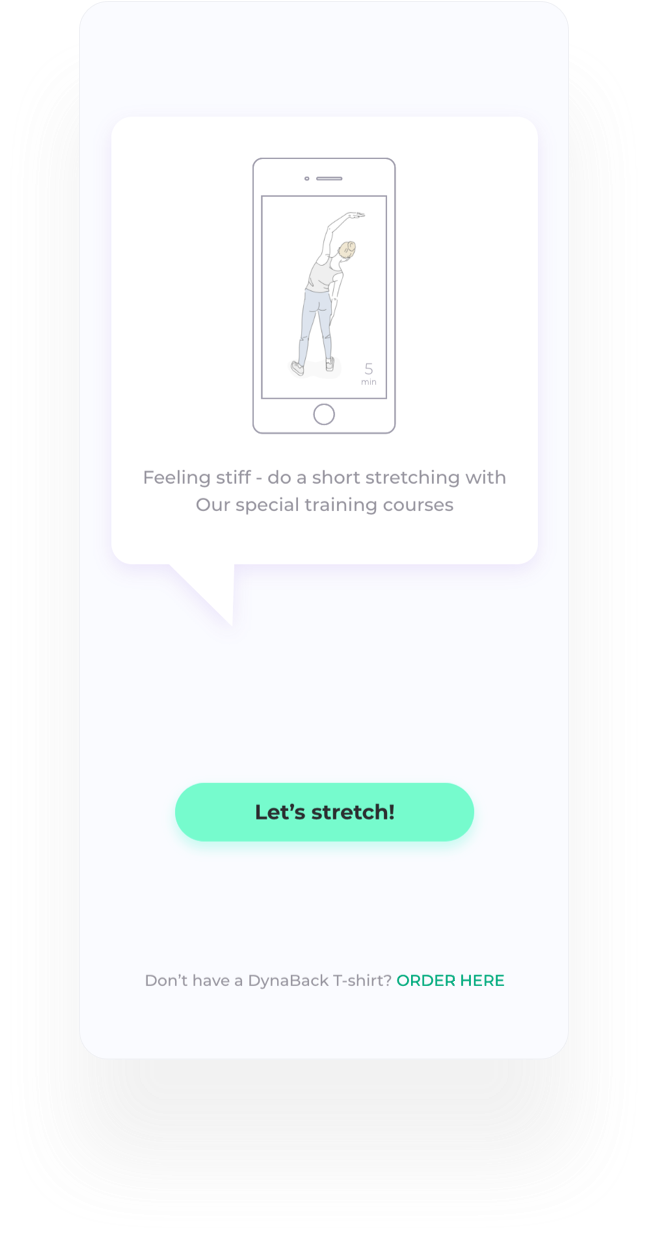
Calibration required the user to hold a short stretch, and I framed it as a stretch on purpose - to make a technical step feel like a health one. Testing showed that was the wrong call. Participants read the framing as evasive rather than friendly, and others skipped the step entirely. I rewrote the screen to say plainly what calibration is and how long it takes, kept the “stretch later” escape with a short note on why even small movements help, and raised automatic background calibration with engineering as the structural fix.
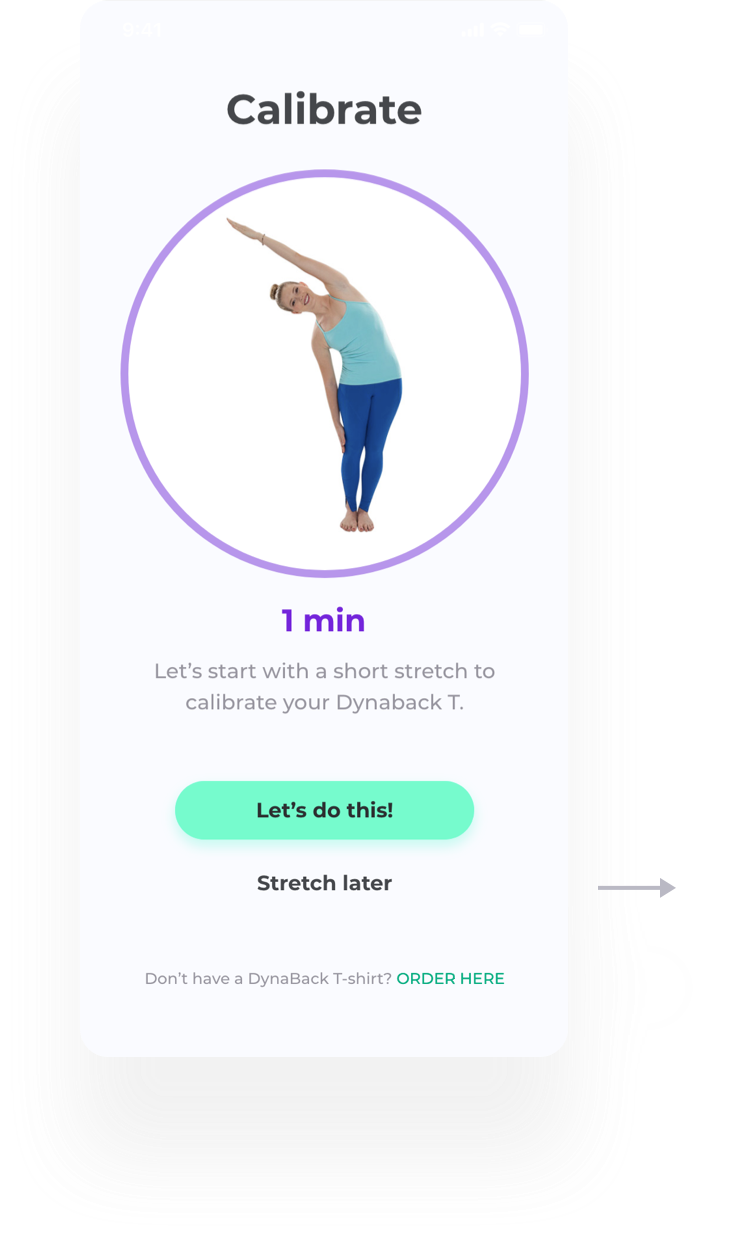
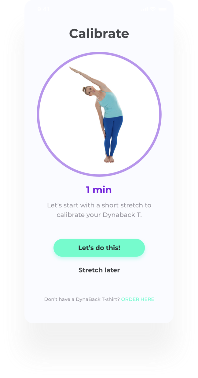
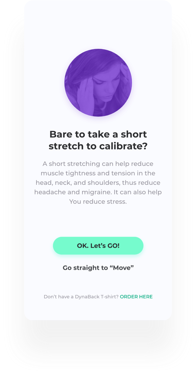
Calibration required the user to hold a short stretch, and I framed it as a stretch on purpose - to make a technical step feel like a health one. Testing showed that was the wrong call. Participants read the framing as evasive rather than friendly, and others skipped the step entirely. I rewrote the screen to say plainly what calibration is and how long it takes, kept the “stretch later” escape with a short note on why even small movements help, and raised automatic background calibration with engineering as the structural fix.
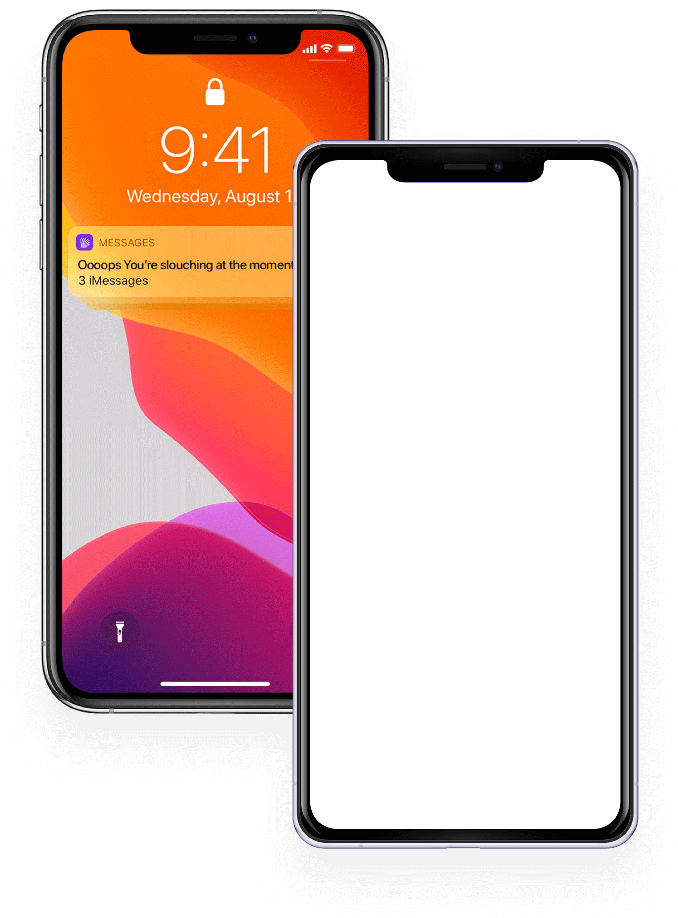
In-app and lock-screen notifications are the only route to a user who is not looking at the app - which is most of the working day. Each prompt carries its reason rather than a bare instruction to move, because a notification that cannot explain itself is the first one people mute.
“Move” holds short exercise sets - recordings by yoga and pilates teachers and rehabilitation specialists, made with Dynaback’s chiropractors and focused on spinal health and movement. It is the one part of the app that works with no hardware at all, which is what makes it the entry point for people who do not own the t-shirt yet. Custom messaging in the “+” section addresses the two groups differently. The pre-release empty state tells unregistered users what is coming and offers to notify them, rather than leaving a dead screen.
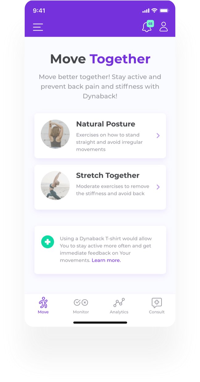
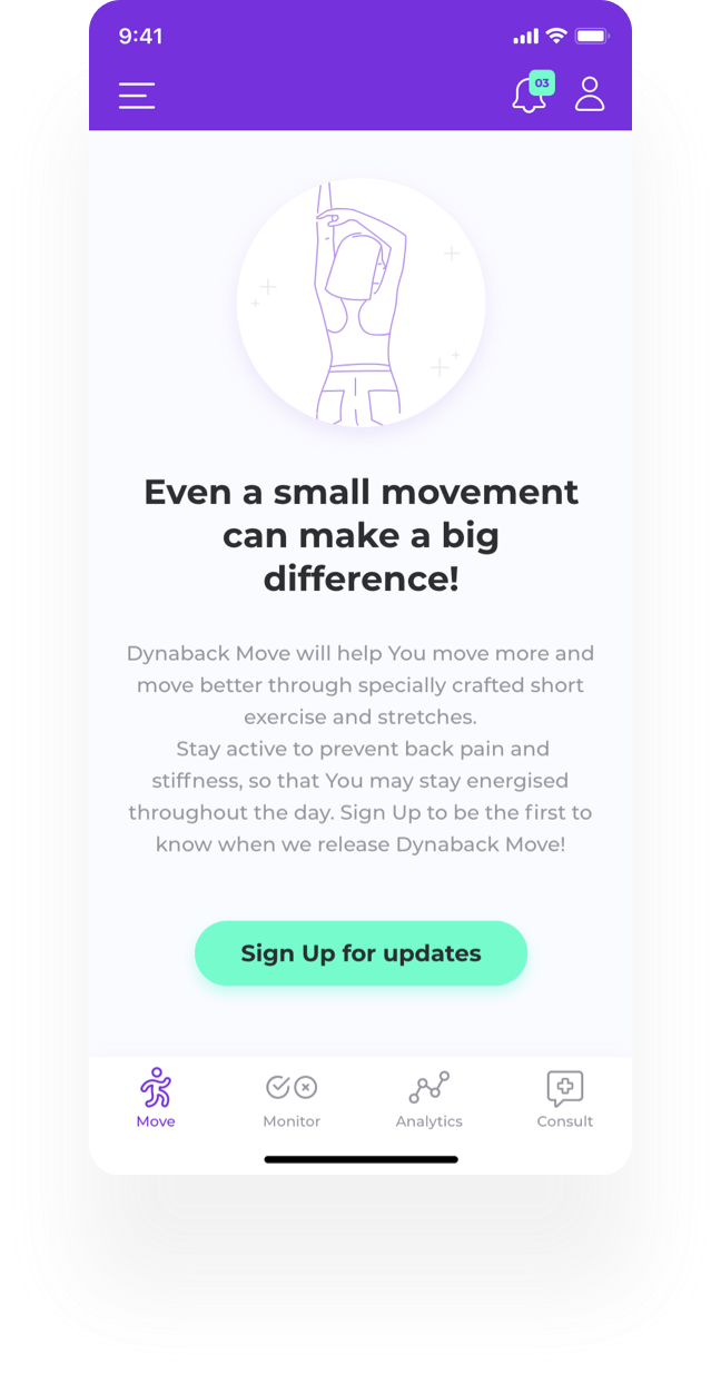
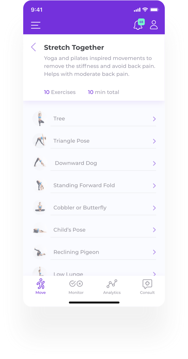
“Move” holds short exercise sets - recordings by yoga and pilates teachers and rehabilitation specialists, made with Dynaback’s chiropractors and focused on spinal health and movement. It is the one part of the app that works with no hardware at all, which is what makes it the entry point for people who do not own the t-shirt yet. Custom messaging in the “+” section addresses the two groups differently. The pre-release empty state tells unregistered users what is coming and offers to notify them, rather than leaving a dead screen.
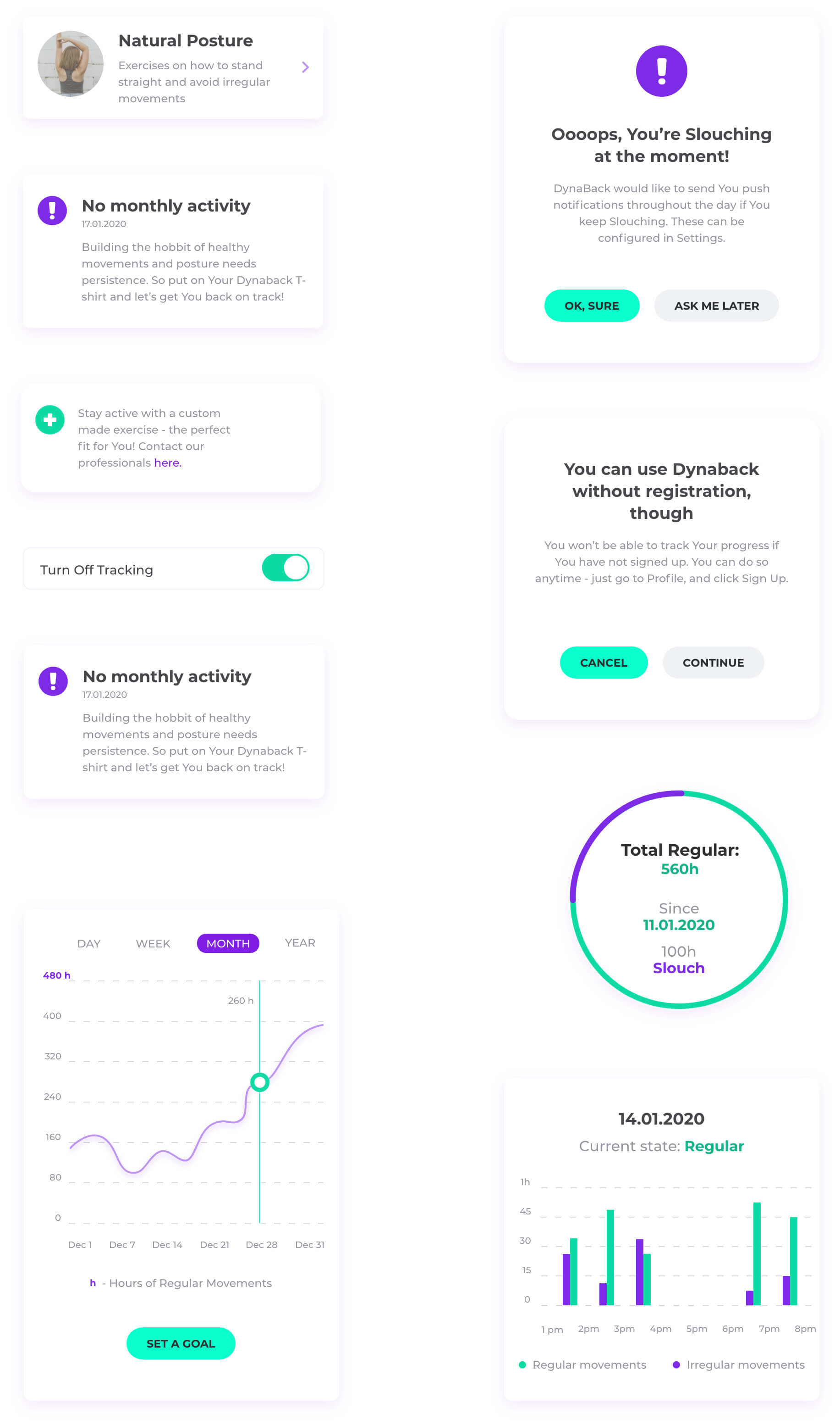
Analytics is where the sensor data has to justify the hardware: hourly regular and irregular movement for the current day, and the same measure rolled up daily, weekly and monthly, so progress is visible as a trend over weeks rather than as a single-day score. Milestones can be shared, at the user’s initiative. Analytics sits behind registration - a deliberate trade. It is the strongest reason to create an account, and it also means a first-time user reads about the value instead of seeing it. That is the weakest point in the flow and the first thing I would test in the next round.
Analytics is where the sensor data has to justify the hardware: hourly regular and irregular movement for the current day, and the same measure rolled up daily, weekly and monthly, so progress is visible as a trend over weeks rather than as a single-day score. Milestones can be shared, at the user’s initiative. Analytics sits behind registration - a deliberate trade. It is the strongest reason to create an account, and it also means a first-time user reads about the value instead of seeing it. That is the weakest point in the flow and the first thing I would test in the next round.
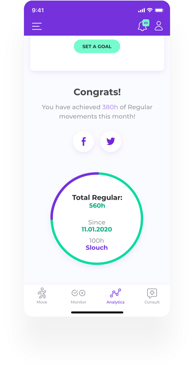
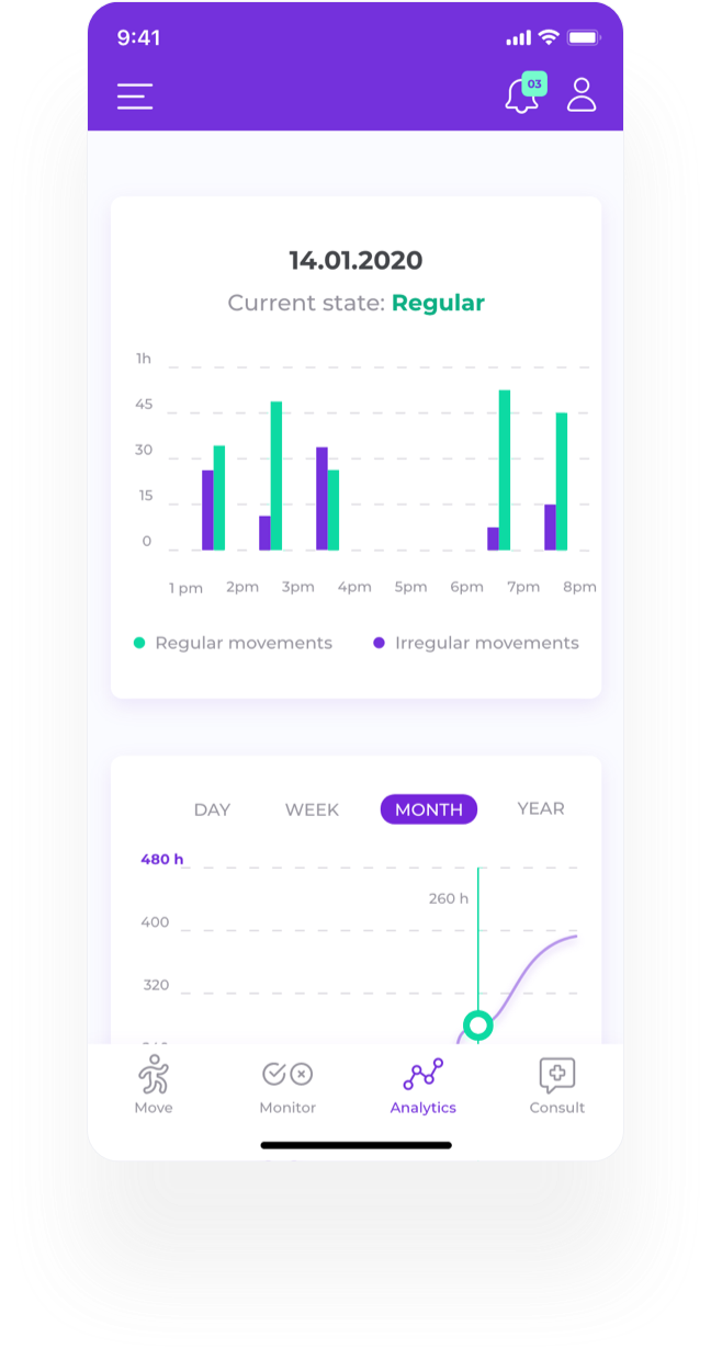
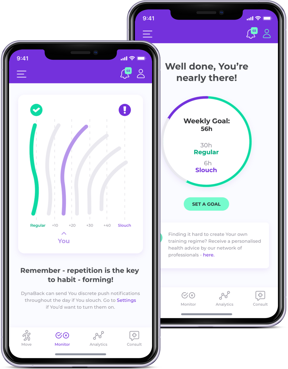
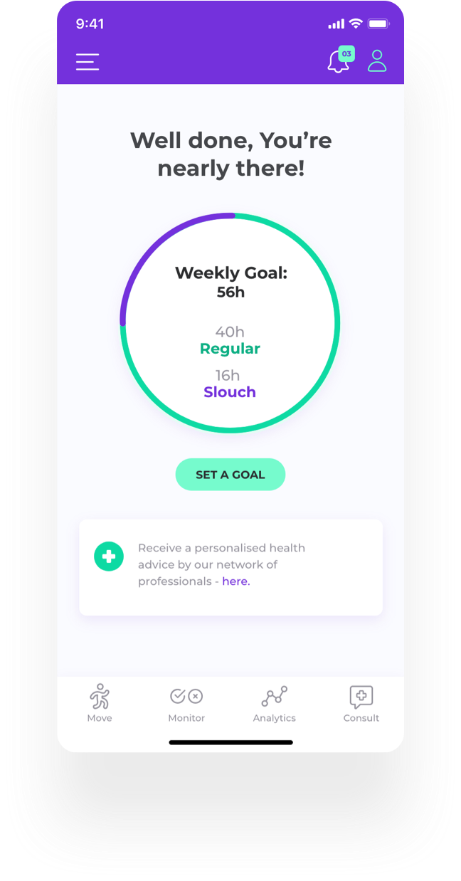
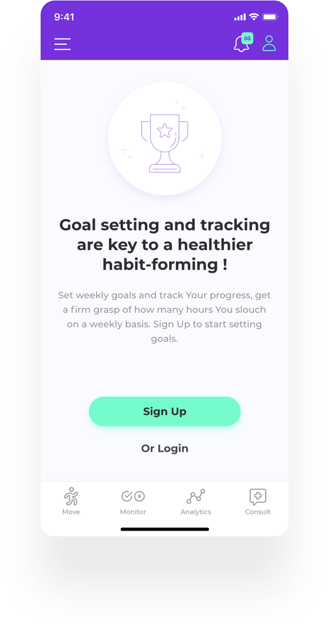
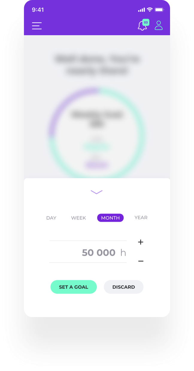
The profile screen is where progress and goals live. Goal-setting is a well-established habit-forming mechanic in activity and self-care apps, and it works here because the goal is set in the unit the sensor already measures - regular movement - rather than in a proxy the user has to take on trust. In testing, though, no participant set a goal unprompted: the screen explains the feature after the moment it would have been useful.
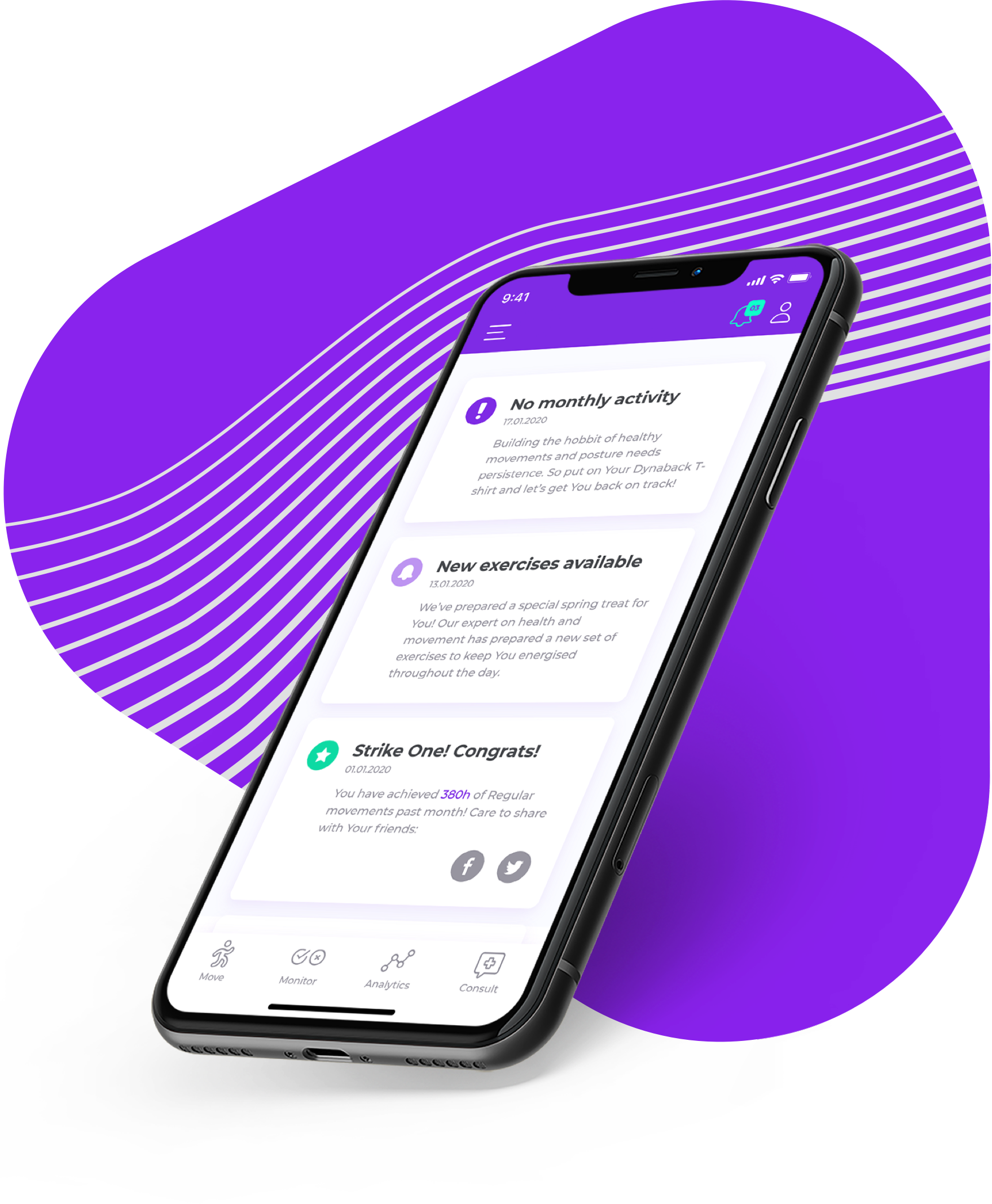
The notifications section carries three types: posture warnings, product updates, and progress milestones. The decision that mattered here was restraint. Notifications are the app’s main lever, and in a health product an over-firing lever gets muted and then uninstalled - so warnings are triggered by the user’s own movement data rather than by a fixed timer, every type can be switched off separately in settings, and milestones are shareable but never posted automatically.
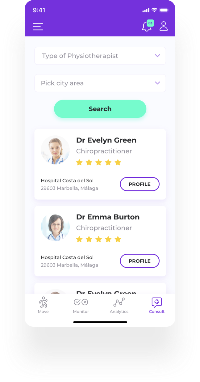
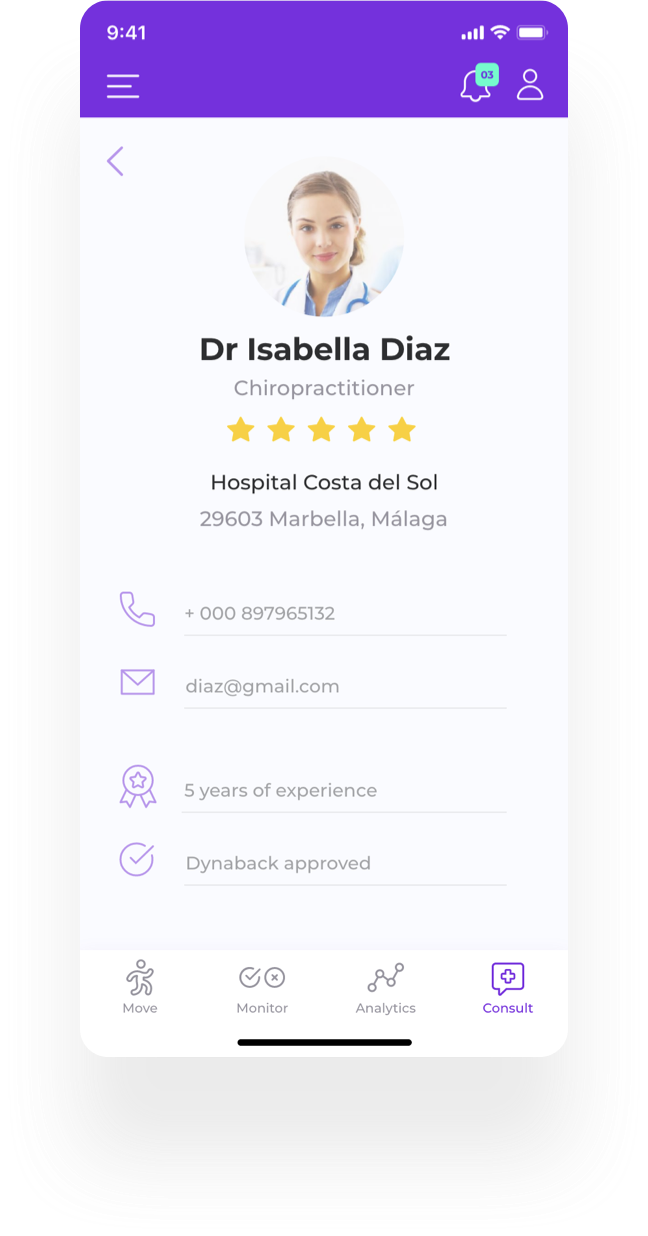
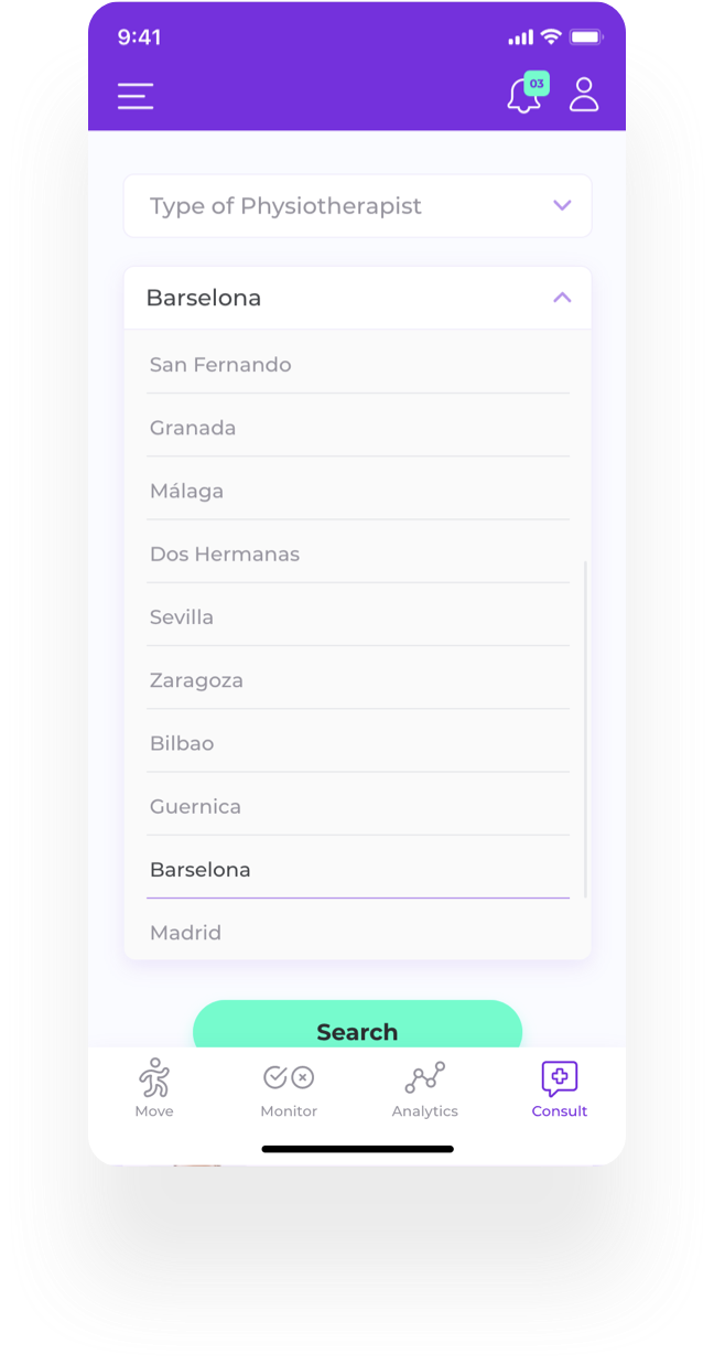
Consult gives access to a vetted network of physiotherapists specialising in spinal injury, movement and posture, searchable by location and specialism. Credibility is the point: the app gives advice about a medical problem, and a route to a qualified human is what keeps that advice on the right side of the line. In testing this section went unnoticed until I moved it into the tab bar.
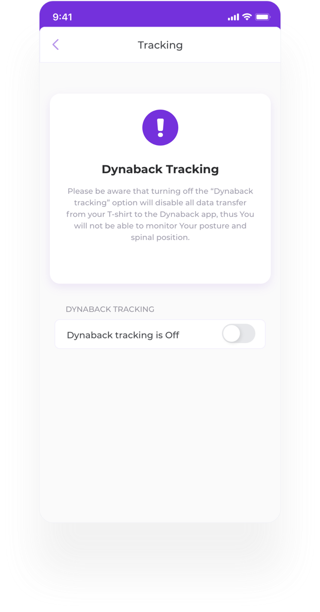
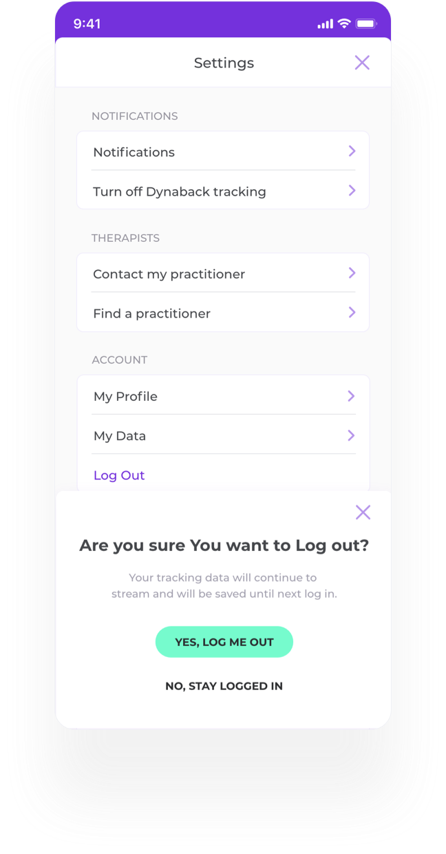
Three states needed explaining rather than defaulting.
“Logged out” - what happens to the flow of data while the user is signed out.
“Turn off Dynaback tracking” - what they lose by switching the t-shirt tracking off, stated before they confirm rather than after.
“Notification settings” - each type switchable separately, so muting posture warnings does not also mute goal reminders and the user is not pushed into an all-or-nothing choice that usually ends in all-off.
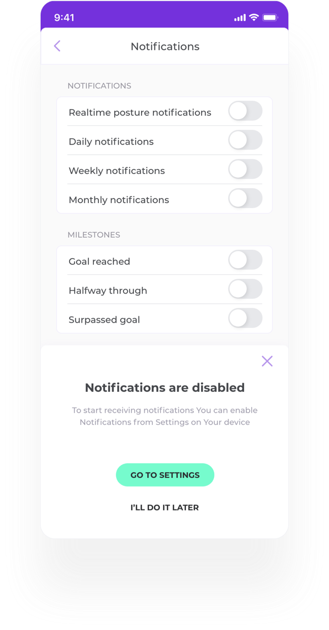
Six moderated sessions on the high-fidelity prototype, with desk-based professionals recruited from my own network and screened for sedentary work and existing back or neck discomfort - some run in person, some remotely over video. Think-aloud, with tasks covering first run and sign-up, Bluetooth pairing, calibration, reading analytics, setting a goal and finding a professional. The screens above are the revised design.
A convenience sample of six is enough to surface blocking usability problems and not enough to say anything about preference or rates. Where the notes below point at a rate, they are a hypothesis for a larger test, not a result.
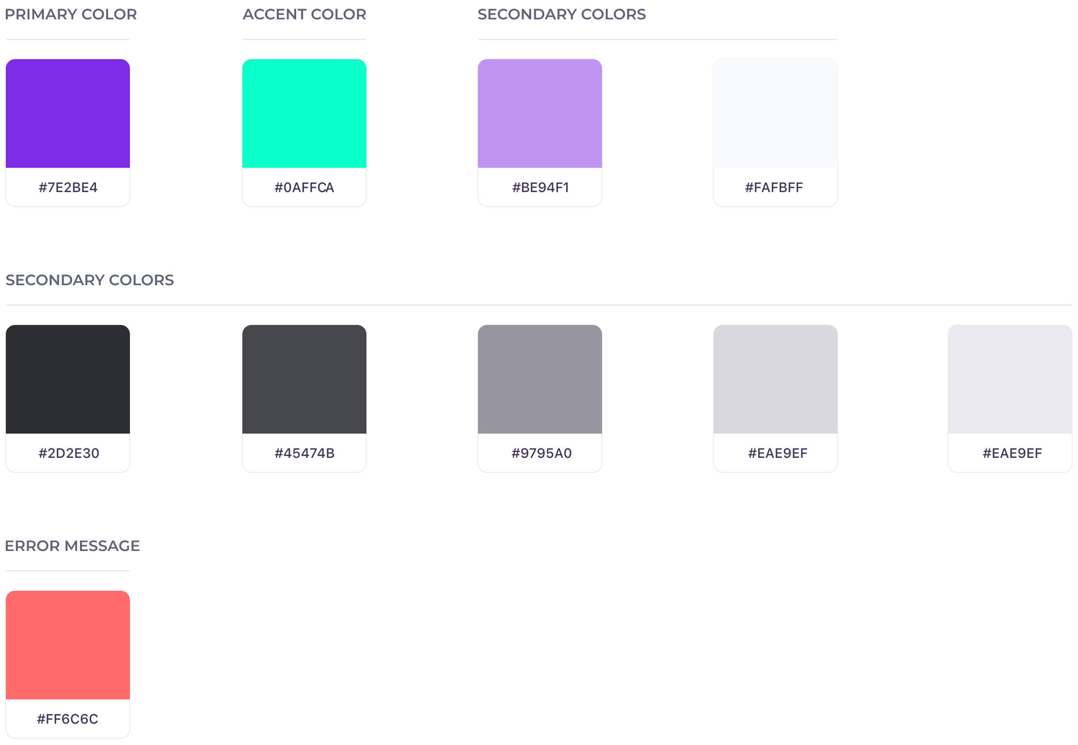
Colors
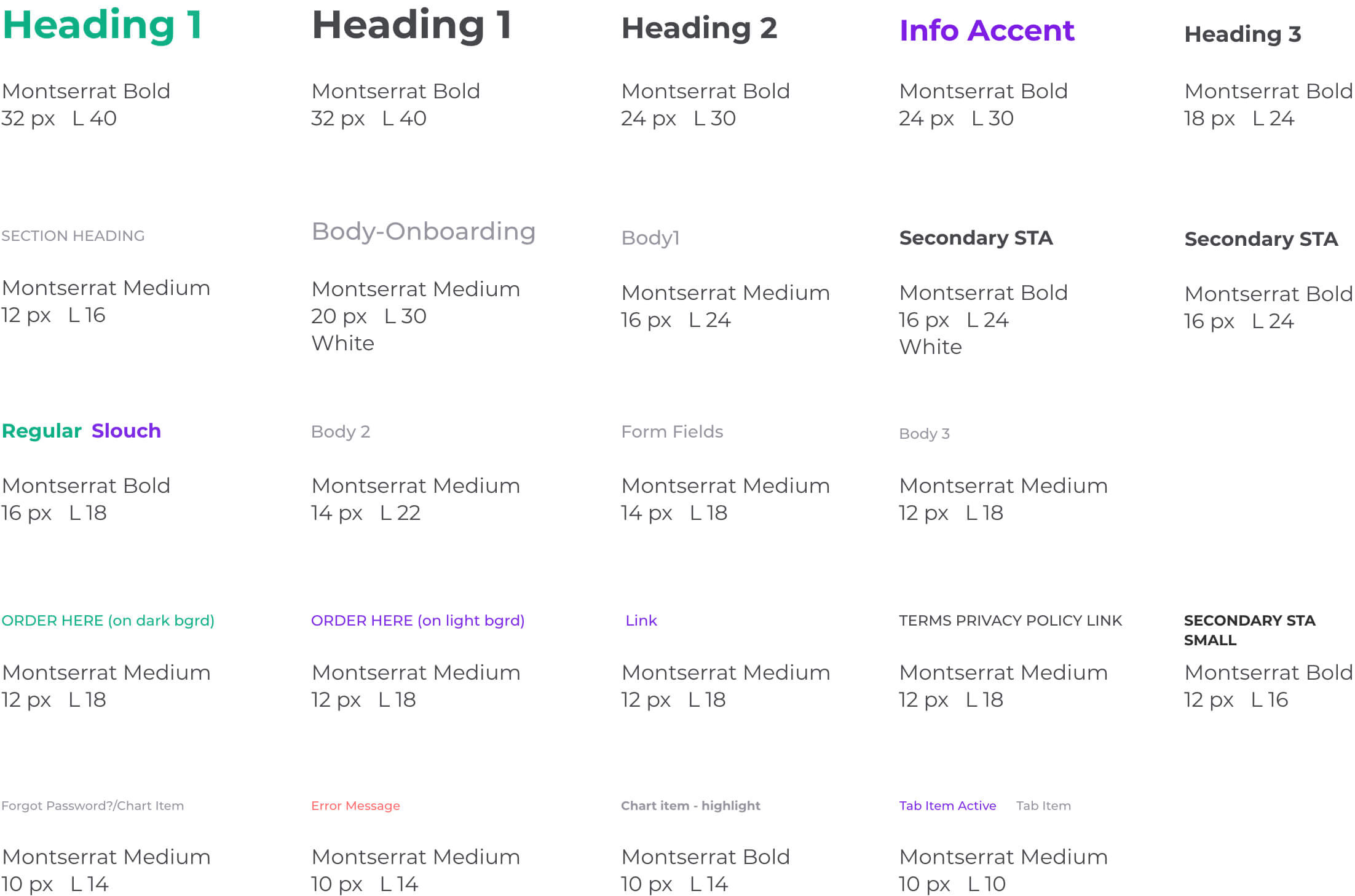
Typography
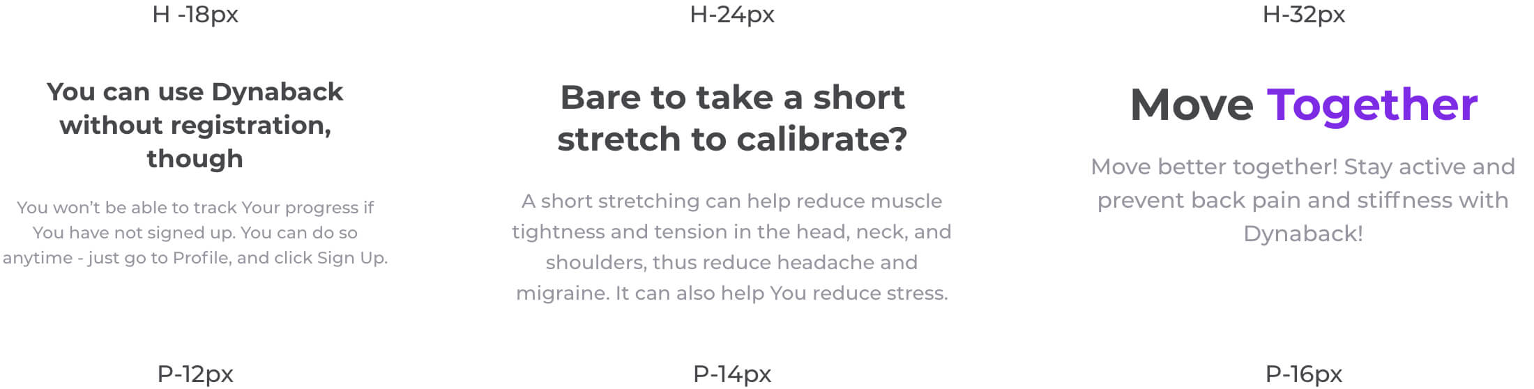
Headings & Body pairings
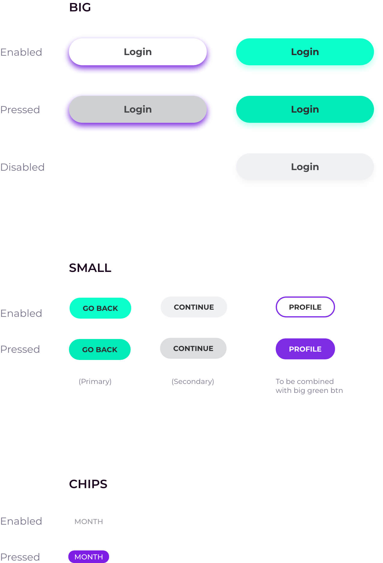
Buttons
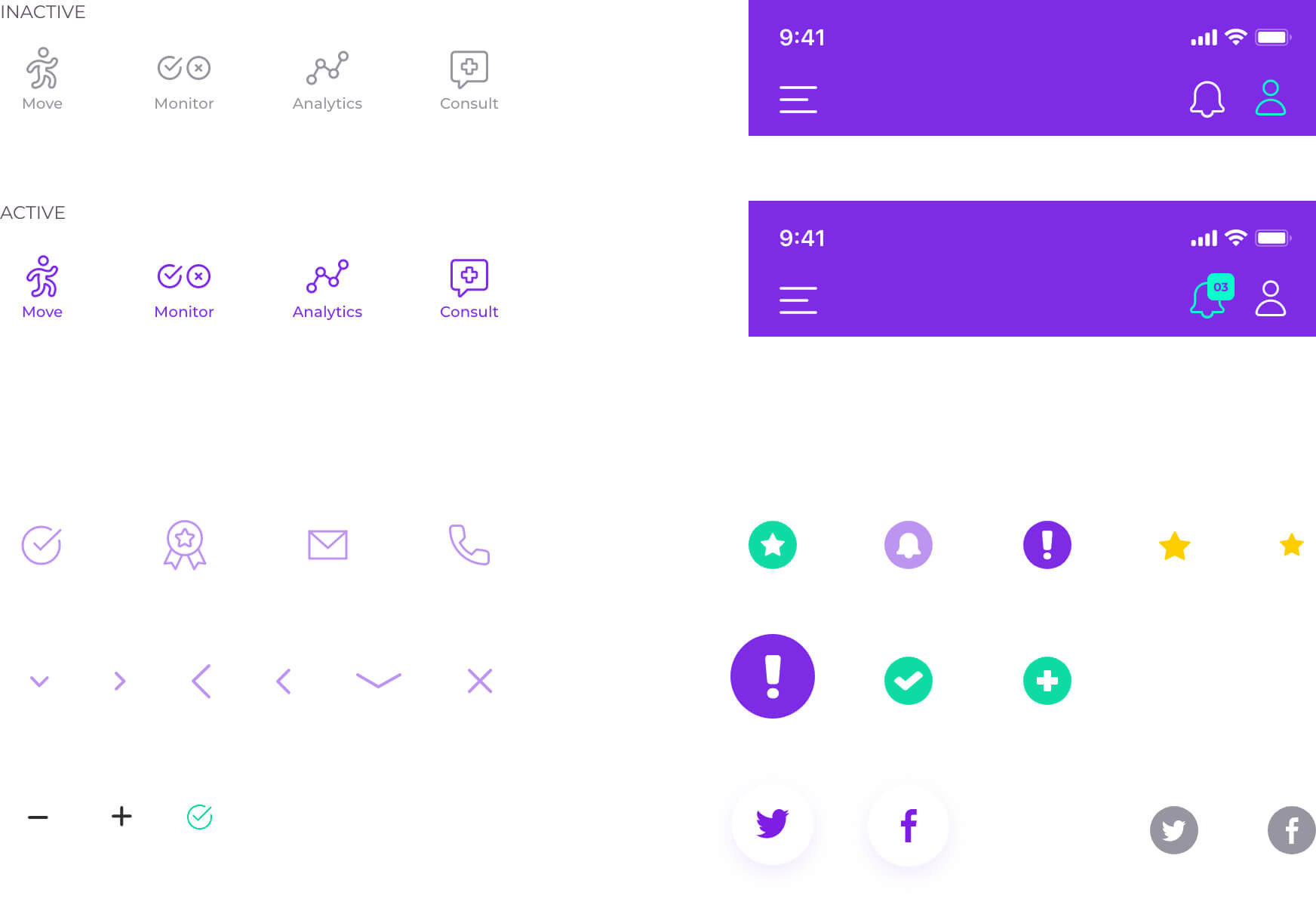
icons
CARDS AND GRAPHS